Finding the perfect paint for a room is always one of the most exciting (yet nerve-wracking) parts of decorating, especially when you’re looking for the perfect neutral paint colour. It’s not simply a case of picking a shade you like. You also need to work out what actually works in the room and complements all the furniture and finishes you already have. Trust me, I’ve tested so many different shades of white and neutral by now that finding the one can feel like looking for a needle in a haystack. But when you finally find that shade you’ve been looking for and everything comes together beautifully, it’s so worth it. We’ve used quite a few neutrals in our homes over the years, and most recently, I’ve had to choose one for our master bedroom. It hasn’t been an easy decision but I’m keeping my fingers crossed that I’ve picked the right one for our south-facing bedroom. The room isn’t finished yet, so I can’t show you the results just yet. In the meantime, I thought I’d share five other white and neutral matt paint colours we’ve used in our homes so far (all of which I’ve been really happy with).
1. Dulux – Timeless
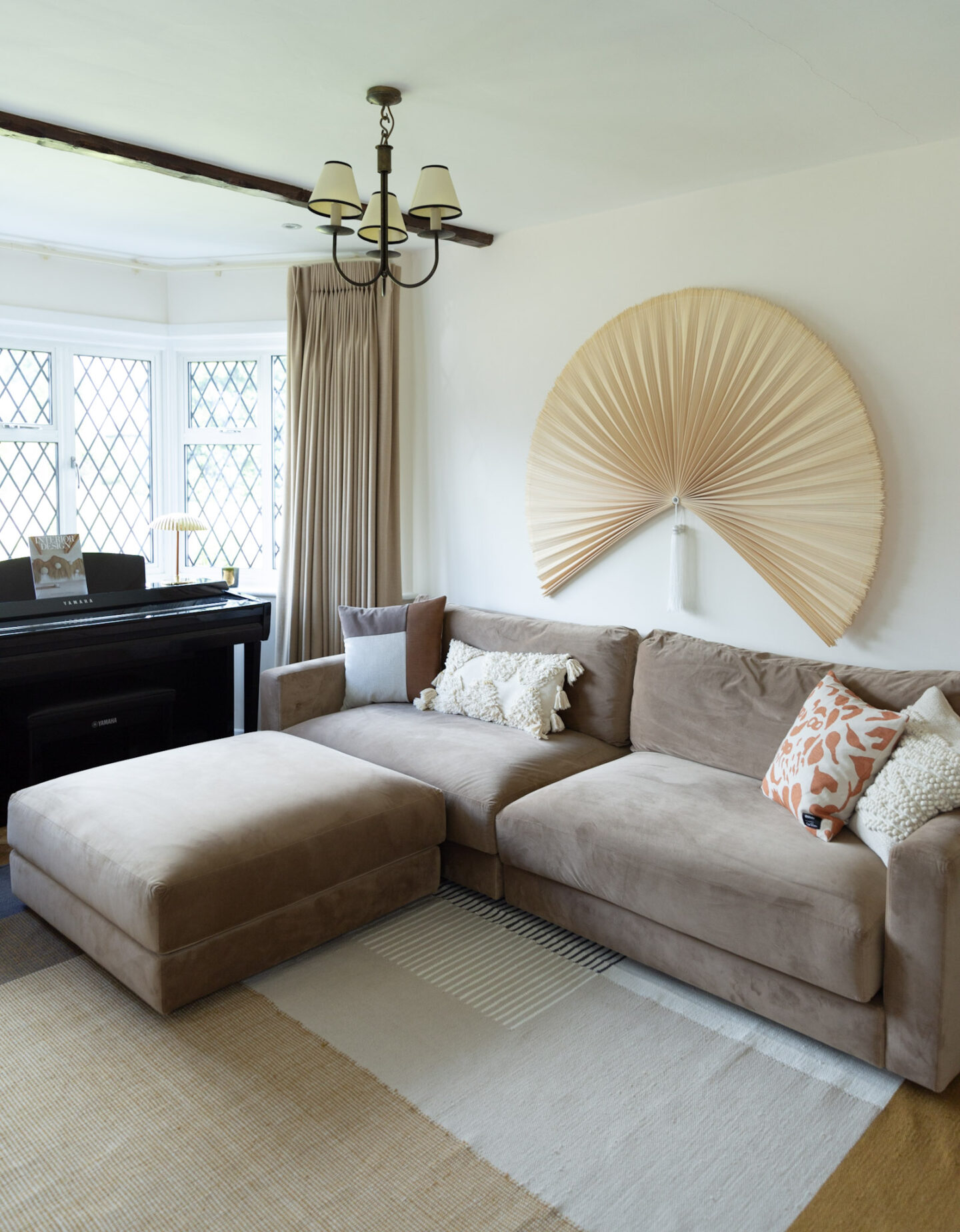
Dulux Timeless in a south-east facing dining room.
We used this paint in the very first house we bought, which we had quite extensively modernised, so it worked really well with the overall look. The matt finish was hardwearing, although it did need the occasional touch-up after the kids were born. One of the things I liked most about warm white was how well it worked with almost any colour, making it an easy choice for several rooms throughout the house. That said, I probably wouldn’t choose it for our current home, particularly in a north-facing room. We now live in a period property that benefits from a little extra warmth, and I think Timeless might feel a bit too cold or clinical in a room that doesn’t get much natural light. I do think older properties often suit creamier tones better than true whites, unless you’re going for a more contemporary look or have plenty of natural light to work with. Of course, it’s entirely down to personal preference but I’ve definitely found myself gravitating towards warmer neutrals since moving into our current home.
2. Dulux – Almond White
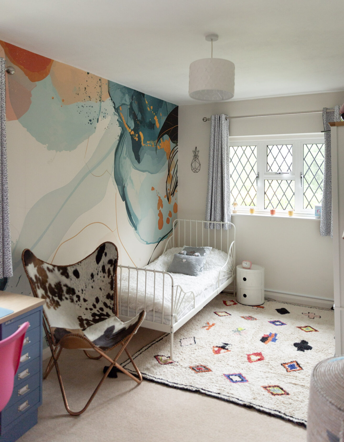
Dulux Almond White in a south-facing bedroom.
Another Dulux shade we’ve used is Almond White, which we chose for my daughter’s bedroom. It’s a lovely creamy neutral that brings a little extra warmth to north-facing rooms thanks to the orange and grey undertones. It can look quite buttery in south-facing spaces, which might not be to everyone’s taste. As my daughter’s bedroom faces south, I knew it could be a bit of a risk, so I tested it on the walls first to see how it would look throughout the day. My instinct was to choose something warm that would complement the colours in the colourful wall mural. There’s also quite a bit of oak in the room, which adds to the warmth. I’ve been so happy with the choice. It’s a beautiful off-white that blends in effortlessly without competing with the feature wall. Instead, it makes the whole room feel cosy and soothing, which is exactly what I wanted for a bedroom. We also have a contemporary built-in wardrobe in an off-white finish, and the two shades work really nicely together. I could have gone for something a little brighter, but the slightly creamy undertone of Almond White gives us just the right amount of warmth without looking too yellow.
3. Fired Earth – White Mulberry
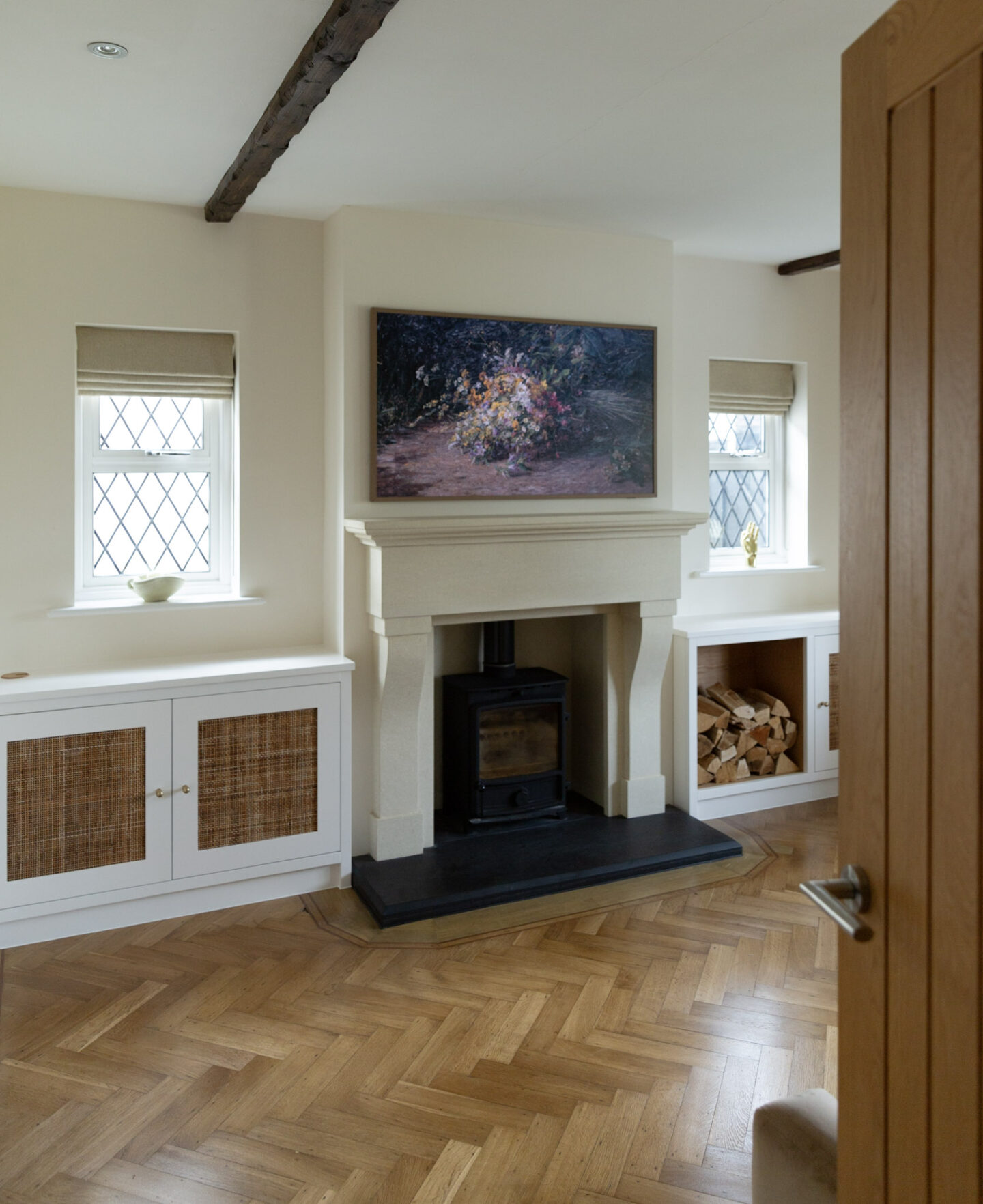
Fired Earth White Mulberry matches the limestone fireplace in a north-facing room.
Fired Earth is one of the premium paint brands we’ve tried in our new house, and I’ve been really impressed with White Mulberry. We painted the room around three years ago and I haven’t had to touch it up once since. It’s a delicate, warm neutral that can look quite beige in strong sunlight. That was actually what I wanted for our fireplace room, as I needed a shade that would complement our sandy limestone fireplace. It’s been the ideal choice for a north-facing room that receives relatively little natural light. It feels soft and tranquil, particularly in the evening, and works beautifully with beiges, browns and even black accents. I suspect the quality of the pigments and the coverage are part of what makes me love this paint so much. It has a lovely depth to it without feeling heavy. I probably wouldn’t choose White Mulberry for a south-facing room unless I specifically wanted a more beige-looking neutral. But in this room, it’s just perfect.
4. Brilliant White – Unbranded
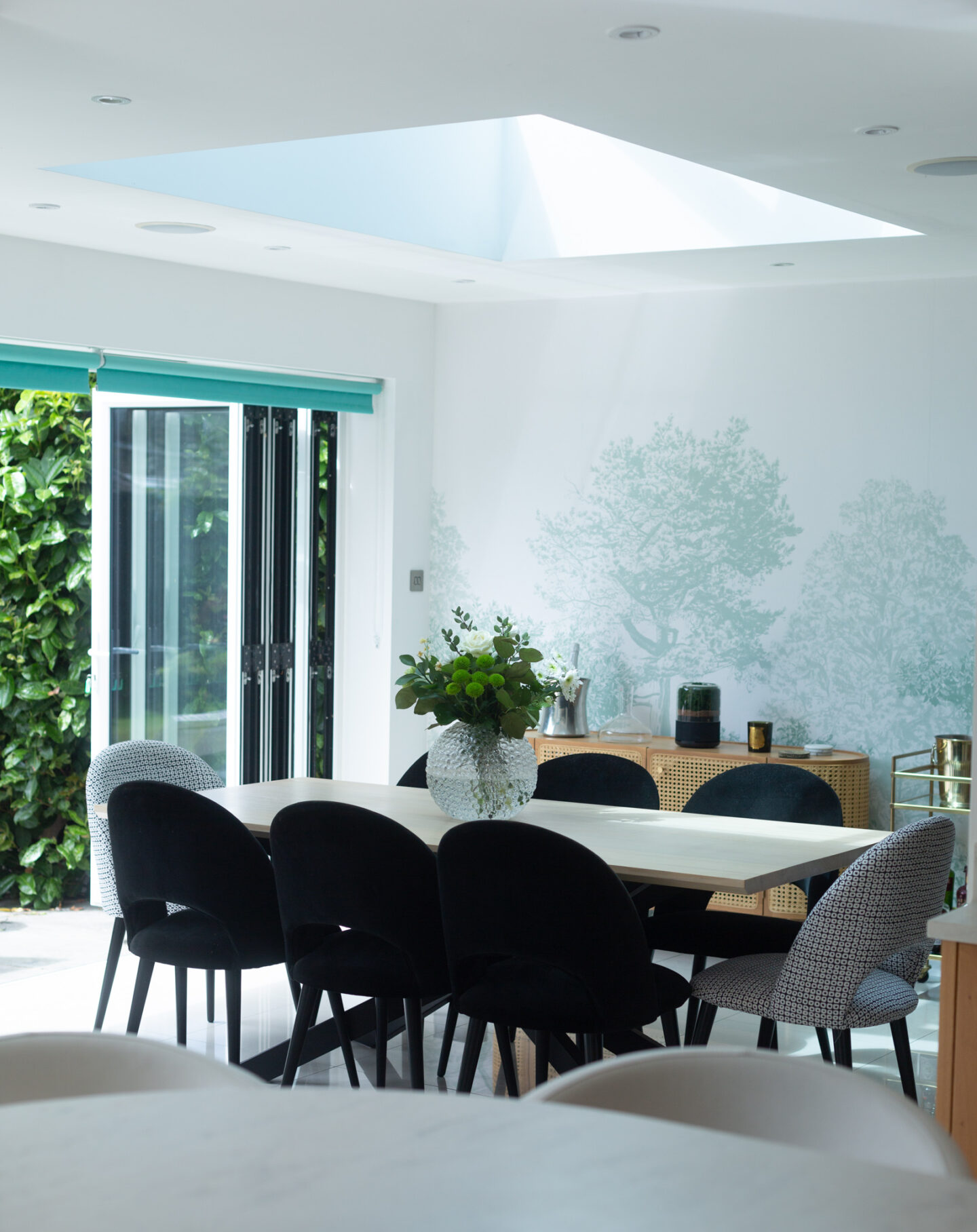
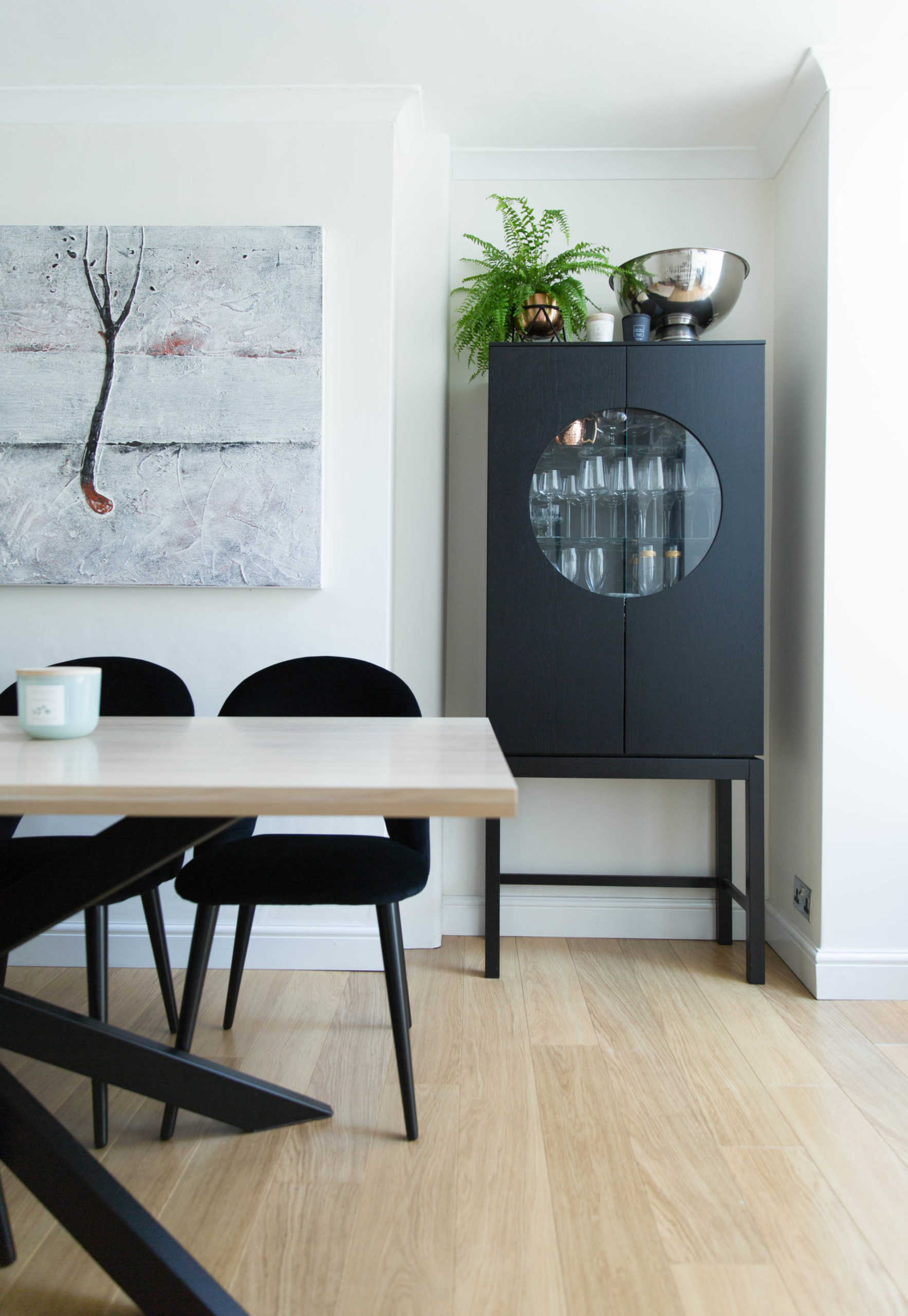
Brilliant White was used on both the walls and the ceiling.
When we installed the new tree wall mural in our dining room, we needed to find a white that would match the existing walls. Rather than repainting the entire room, we had to make an educated guess at what the previous owners had used. We settled on a brilliant white from a DIY store, and it turned out to be the closest match. Luckily, this is a very light-filled, south-facing room, so the cooler tone works beautifully. We get plenty of natural light through the windows and the walls never feel too cold or stark. The only thing to bear in mind with brilliant white is that, because it has very little undertone of its own, it can reflect the colours around it quite noticeably. In our dining room, there’s a lot of green from both the garden and the tree wall mural, so the walls can occasionally take on a subtle green tint. Rather than being a problem, I actually think it works really well with the rest of the room. It complements the green tones, the white porcelain flooring and even the black dining chairs. For me, brilliant white is a great option if you’re after a cleaner, more contemporary look, particularly in a room with plenty of natural light.
5. Ca’ Pietra’s Proper Good Paint – Maples Cloth

Ca’ Pietra’s Proper Good Paint collection: Maples Cloth complements the mural beautifully.
Another off-white we’ve used is Maples Cloth by Ca’ Pietra. It’s a slightly creamy shade without being too yellow, and we used it in my eldest daughter’s north-facing bedroom. It looks beautiful alongside the cloud feature wall and really blends in perfectly. We also used the matching wood paint on the desk, which helps tie everything together. It’s an elegant, timeless neutral that adds warmth to the space without making it feel overly warm or beige. There are actually several different shades of white and neutral in this room, which just goes to show that you don’t have to stick to a single white throughout your home. In fact, combining a warmer shade with a lighter, crisper white can create a really lovely contrast and give a room more depth and interest. I think Maples Cloth strikes that balance beautifully. It feels warm and inviting while still looking fresh, making it a lovely choice for a bedroom that doesn’t get quite as much natural light.
How to Choose a Neutral Paint Colour
Choosing the right white or neutral is never quite as straightforward as it might seem. A shade that looks beautiful in one room can feel completely different in another, depending on the natural light, the direction the room faces and the colours and materials around it. I’ve learnt that it’s always worth testing a few samples on your own walls and looking at them at different times of the day before making a final decision. The other thing I’d recommend is choosing your furniture first, if you can. I know it’s tempting to paint before moving everything in to avoid the mess, but doing so can limit your options when it comes to choosing the right shade. You don’t really know how a room will look until it’s fully furnished, with the curtains, rugs, furniture and all the finishing touches in place. Having a proper mood board definitely helps, but I still find that the reality can look quite different from what you imagined.

