You have no idea how relieved and happy I am now that our never-ending bathroom renovation is finally finished. Honestly I thought we’d never get there. Our bathroom reno got delayed by a few months when our bathroom fitter broke his hand, but luckily it all turned out fine in the end. This make-over has felt like the hardest of them all. I think it’s got a lot to do with the fact that I did all the designing, project managing, hiring and sourcing the materials myself. I knew that if this room would look like a mess, I’d only have myself to blame and nobody else. Luckily, I think it turnout great and I really hope you like it too.Our downstairs bathroom wasn’t really that bad to begin with. It was a pretty standard bathroom but it was totally lacking any wow factor for me. We installed real marble floor tiles when we moved in but it didn’t take too long before you could see some wear and tear. It wasn’t ideal to be honest and I knew that I’d like to renovate the bathroom entirely at some point.Here’s what our old bathroom used to look like..
We pretty much changed everything. I had always wanted a fully tiled marble bathroom with some striking matt black accessories. Obviously I was always going to go for a monochrome theme just like the rest of the house, right? Also, I figured if we were to ever sell this house and the next owner wasn’t a monochrome fan, it would be quite easy for them to replace the black taps with chrome ones. Marble effect tiles are timeless and I’m yet to meet a person who doesn’t like marble, so I thought it’s a safe bet. But essentially I designed this bathroom for me and wanted it to be my dream bathroom and something that I will enjoy everyday. I was lucky that my husband had only two requests and that was to install a jacuzzi bath and a rain shower. I made sure that he liked the tiles and the appliances too of course. Luckily our taste is pretty similar though. I don’t think neither of us could live with a pink bathroom (no offence to any pink bathroom owners out there!)Are you ready for the after photos?
LAYOUT
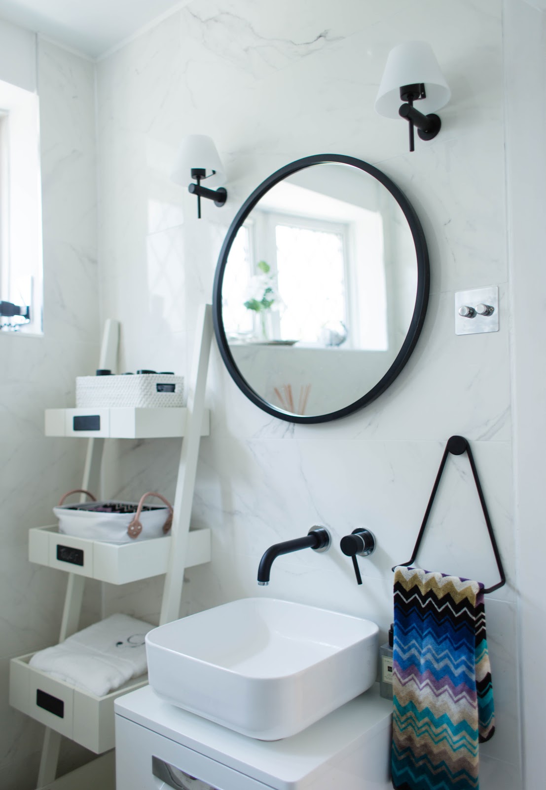
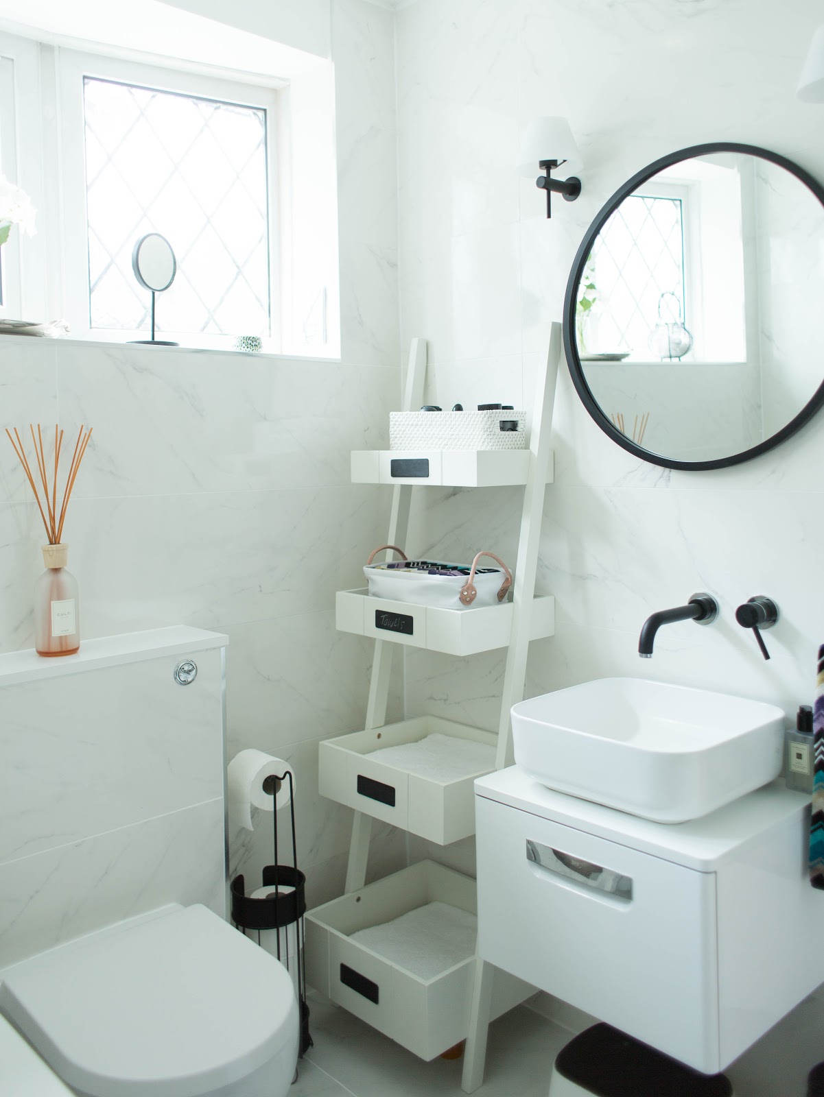
Our downstairs bathroom isn’t huge which meant that I didn’t really have a lot of options to do anything drastic with the layout. We wanted to keep the bath (or to get a new one) and I knew it would take up most of the room. The old layout didn’t work for me at all in terms of the aesthetics, so I decided to move the toilet next to the bath and the basin against the opposite wall. If you’re planning to move plumbing around like I did, be prepared to pay a bit extra for that as it’s a pretty time consuming job. I do think it was worth it as the black round mirror above the basin really makes a big difference, don’t you think?
MARBLE EFFECT TILES
I always wanted a fully tiled marble bathroom but I wasn’t going to repeat the mistakes I made with our bathroom mini make-over. To keep it short, we installed real marble tiles 5 years ago that started to deteriorate only after a year or so. It totally put me off real marble in the bathroom and I chose marble effect porcelain and ceramic tiles for this project in stead. I went for very realistic looking marble effect tiles by an Italian manufacturer called Pasta Blanca. Our bathroom fitter sourced the tiles directly from N&C Tiles and Bathrooms so we could get a trade discount. Gloss tiles can be dangerous when wet (especially if you have small children) so I chose matt marble effect porcelain tiles for the floor. I picked the glossy ceramic tiles for the walls so that we could maximise all the light that comes in. Our bathroom isn’t huge so gloss tiles are great because they allow light to bounce around the room.
TAPS AND SHOWER HEAD
Few years ago I saw the dreamiest black matt basin mixer tap on Pinterest and knew that if we ever decide to redo the downstairs bathroom, I will need this tap to go in it. It’s funny, I kind of picked the tap for this room before the tiles which sounds a little crazy I know. I do think the mixer tap from Tre Mercati is the dreamiest tap out there but according to our fitter it wasn’t exactly the easiest to install. But I have to say that is does look absolutely fabulous!
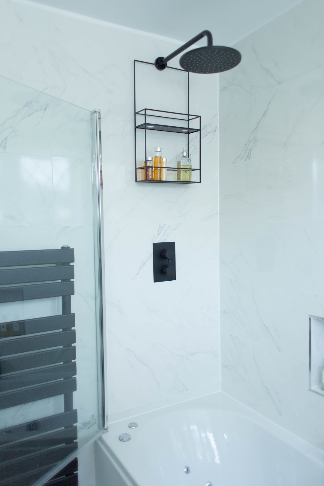
The bath mixer tap is also from Tre Mercati but I couldn’t find a shower head from the same range (that would have been delivered on time) so I ordered a similar one from the MODE Spencer range. All the accessories are matt black so you wouldn’t really notice they are not part of the same range. I do feel like the black accessories pull the look together. I did feel a little silly for blowing most of our budget on the accessories but I think it paid off in the end.BATH
It was my husband idea to get a whirlpool bath and although I wasn’t convinced first, I’m definitely a fan now. If you suffer from upper back pain like I do, you’ll find the jacuzzi function a godsend. I’ve been using our jacuzzi bath twice a week since we had it installed which just goes to show it was a great idea in the end. I think the quality is ok, although I was a little surprised some of the chrome parts are actually plastic. I only use bath oils in the bath and also do a monthly cleaning cycle (I use non bio powder). Otherwise, I find it just as easy to maintain as a regular bath.
TOILET
I really wanted a space saving wall hung toilet for this bathroom but it wasn’t possible because the wall it will be fixed onto is load baring. I ordered a compact toilet in stead and our builder also had to add a cistern to it which he luckily boxed up.VANITY UNITInitially, I had ordered a different vanity unit from Soak but it arrived damaged so I had to get another one. I ended up going to our local bathroom store and buying almost an identical (except smaller) vanity unit. To be honest, I think it’s a better size so I guess it was meant to be. I also really wanted a wall hung unit so that we could store things underneath it.BUILT IN SHELVINGStorage was always a big question mark. Our old bathroom had very little room to store anything so I really wanted to create more storage space (which was tricky since this is the smallest room in our house). I thought one long built-in shelf above the bath would be practical and also make a great feature. Of course it also meant that the room would have to be slightly more narrow but was happy to sacrifice few inches for this cool feature.
ADDITIONAL STORAGE
Of course I still needed more space to store all the products so I bought a black shower caddy from Umbra that just hangs off the shower head. I love that is required zero drilling and holes! I also fell in love with this ladder shelf from John Lewis as it really makes the room feel bigger and lighter. I had to get some small storage boxes so it wouldn’t look messy and unorganised. Can you believe we have now more storage space than before which is amazing considering this is our family bathroom after all.
LIGHTING & MIRROR
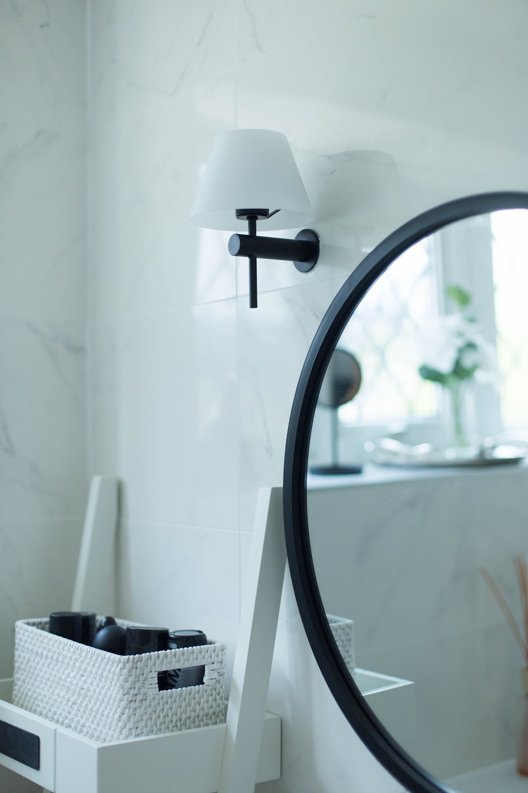
I’ve been eyeing up this round mirror from Umbra for a while now and pretty much knew from day one that it would look great above a white gloss vanity unit. It’s suitable for the bathroom as are the black wall lights from Dusk lighting, It was so hard to find nice black wall lights online. I wanted something quite contemporary and classy. Not too industrial if it makes sense. We installed a double dimmer switch so we could control the wall lights and the spot lights separately. Best decision ever!
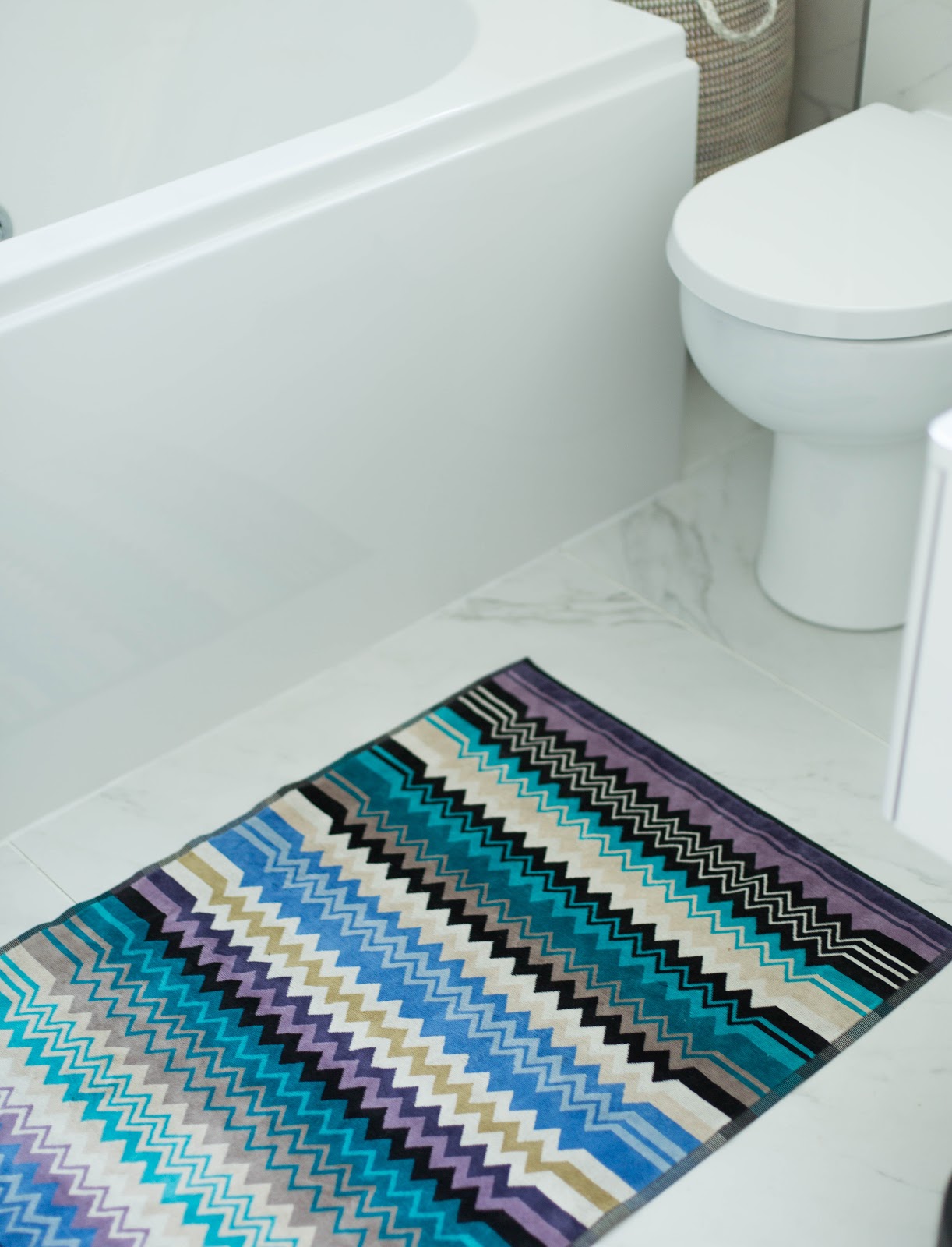
Accessorising the room has definitely been most fun. I felt the room needed a splash of colour as well as a bit of texture to soften the look a bit.The Missoni Giacomo towels and the bath mat (gifted) were on my wish list from day one. I didn’t want to use more than one pattern in the room and Missoni’s famous chevron stripes just seemed perfect. I’m totally obsessed with this range. They are also the softest towels I have ever own.
Now we all know that every bathroom needs a good sized laundry basket, am I right? There is nothing more annoying than clothes on the floor which is why I was thrilled when Garden Trading sent me this woven laundry basket (gifted). It’s the perfect size (medium) for this little corner and it’s also a lot bigger than it looks. I feel it really softens the look too and adds texture to this room. I also have this same basket in size extra large in my bedroom – that’s how much I love them!
Garden Trading also gifted me this chic wire egg basket which I decided to use for cotton wool. It’s such a perfect way to add a bit of industrial chic to our new bathroom.
This project wasn’t easy but somehow we managed to make it work. I faced a lot of challenges along the way (mainly with our fitter who turned out to be pretty unreliable in the end) but I think I should write another blog post about that. This has felt like the hardest make-over of them all, probably because I decided to do everything myself. I wanted to test my design skills and heavily relied on my own instincts and Pinterest. Although, it was stressful at times, I loved every minute of it and I couldn’t feel more proud now that I’m looking at the end result.I really hope you enjoyed this transformation. I’d love to hear your bathroom renovation stories. Leave a comment below or let me know on Instagram!
PRODUCT LIST
Ceramic Tiles Matt Porcelain Floor Tiles
Vanity Unit
Whirlpool Bath
Wall Mounted Basin Mixer
Tre Mercati Mixer Tap for Bath
City Space Toilet
MODE Spencer Shower Set
Woven Laundry Basket (gifted)
Wire Egg Basket (gifted)
Silver Tray (gifted)Faux Flowers & succulent by Sainsbury’s (not available online)
Jo Malone Special Edition Candle
Jo Malone Neroli & Basil Hans Wash
Black make-up mirror H&M (not available online)
Missoni Giacomo Towel Set (gifted)
Giacomo Bath Mat (gifted)
MADE.COM Metal Towel Ring
Umbra Round Mirror
Umbra Cubiko Shower Rack
Ladder Shelf
Rattan BasketAquanova Storage Basket Set (gifted)
Black Towel Rail
Marble effect tiles (similar)
Free Standing Toilet Roll Holder
Black Pedal PinAstro Wall Lights
* Some of the products in this post are gifted.












The black instead of chrome wall-mounted bath mixer taps contrast really well with the clean minimalistic look. Elevating it also gives this sense of grandeur and identity and really works with the way users interact with the tap!
Fairly valid point Sandra, I think it adds to the character if you also have a more rustic feel, it really does stand out and give it more identity as well as making the taps a centre piece of the room. Good thing it isnt vibrant or you would need sports sunglasses to look at it!
Thank you so much, Sandra. Glad you like them too 🙂 Pia
Fantastic blog! Do you have any suggestions for aspiring writers? I’m hoping to start my own blog soon but I’m a little lost on everything. Would you suggest starting with a free platform like WordPress or go for a paid option? There are so many choices out there that I’m totally overwhelmed .. Any ideas? Appreciate it! http://www.summerhaus.com.sg/
Hi there! Thank you 🙂 I would choose Word press (paid option) just in case your blog really takes off and you want to have more control over all the plug-ins, SEO etc. Pia