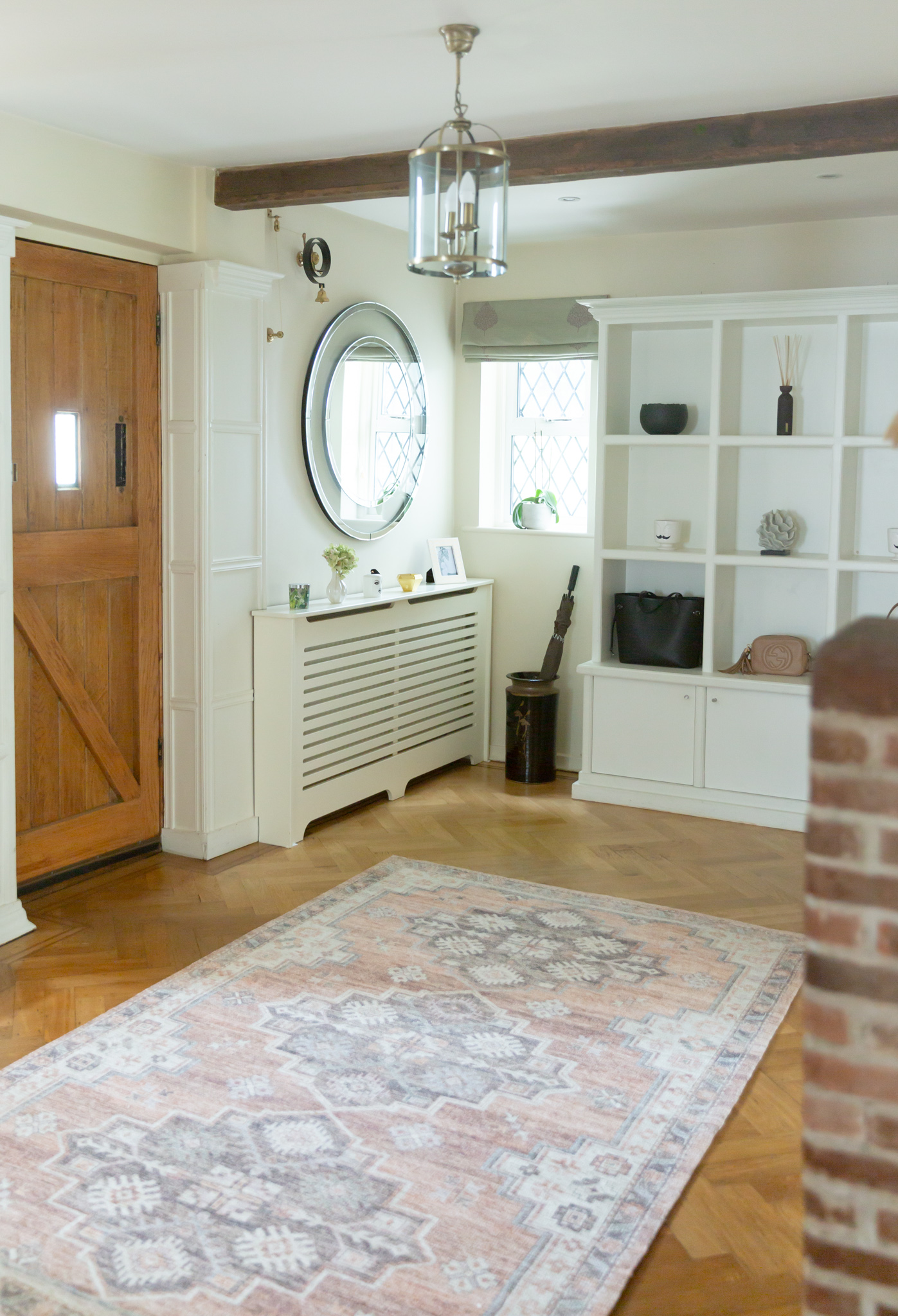
Since the entrance to your home immediately sets the tone for the rest of the house, I didn’t want our (late) 1920s hallway to be anything less than impressive (in a very warm and welcoming way of course). I wanted it to be practical and a little bit more colourful than the other rooms. We’ve kept most of the original features; brick fireplace, butlers bell, oak parquet flooring and of course the 1920s wall panelling. I love mixing contemporary pieces with more traditional accents. They make the house feel more personal and evolved. Our hall doesn’t always look as tidy as this (ha, I wish!) but thankfully we’ve got a decent amount of space. I never quite nail down the whole practicality part in our old hallway, but I think I might get a better shot in the new house. This space used to include both a hallway and a bathroom. I’m not quite sure when it was opened up but the room is now much bigger than originally. It has so much potential and I think it can have even more potential in the future once we finish all the other projects in the house. But for now, I’m happy with all the little changes we’ve made. This is a north-facing room by the way, so photographing it was a little challenging. You only really get this amount of light for about two to three hours max during the winter months.
T H E L I G H T (O R T H E L A C K O F I T)
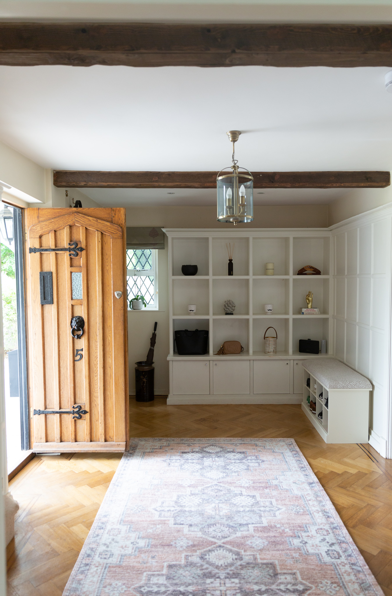
As I said, we could do with more light. But the moodiness can also be wonderful if you decide to embrace it. By embracing it I mean going for bolder colours, textures and a bit of a miss-match look. I’ve kept the walls light but for everything else, I’ve tried to have a bit more fun with it. Thankfully warm, neutral colours work well in north-facing rooms. The original panelling and the parquet flooring can make the space seem a little busy, so I’ve made sure to stick with white built-in furniture and walls. You could also embrace the darkness and go with dark walls, but I prefer to keep it all consistent with the rest of the house. Adding bright accessories (like rugs) and clever artificial lighting also helps to add more light to this space.
W A L L P A N E L L I N G
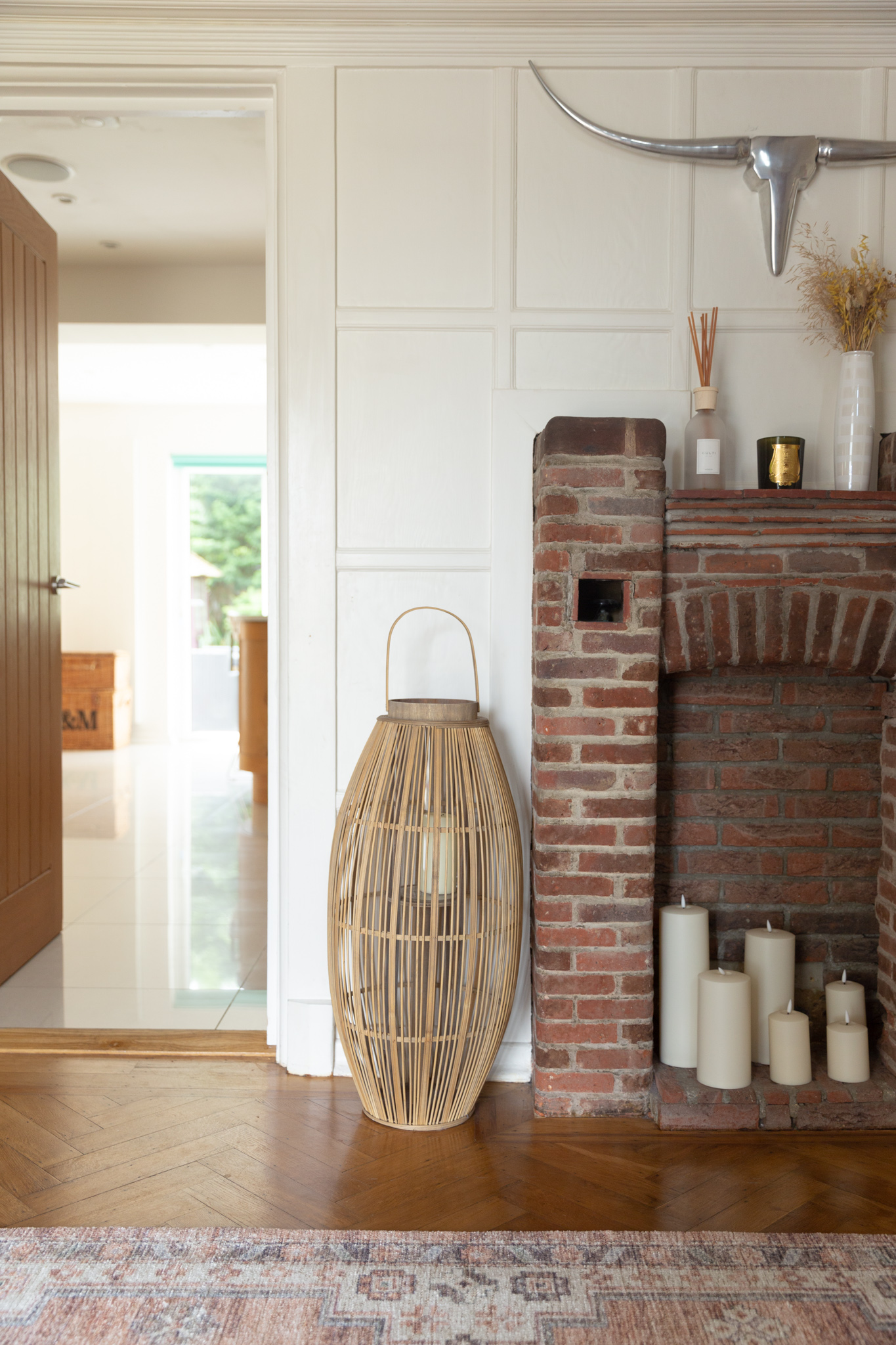
I love traditional wall panelling. It wouldn’t have looked right in our old house but it’s perfect here. Wall panels add so much character and interest. It’s a huge feature just on its own. Panels used to be installed to insulate a room, although they are now used for decorative purposes. Our panelling extends to the staircase and upstairs, like in many character properties. It’s such an integral part of our house that I would never change it. The panelling was painted by the previous owners and I don’t have any plans to change the colour (for now). I love how elegant and stylish the off-white/cream paint looks against the dark floors. Wall panels can make decorating (especially hanging art) a little tricky though, so if you’re thinking of panelling an entire room, you may want to think carefully about how you are planning to decorate/accessorize around it.
S T O R A G E / M O D U L A R U N I T
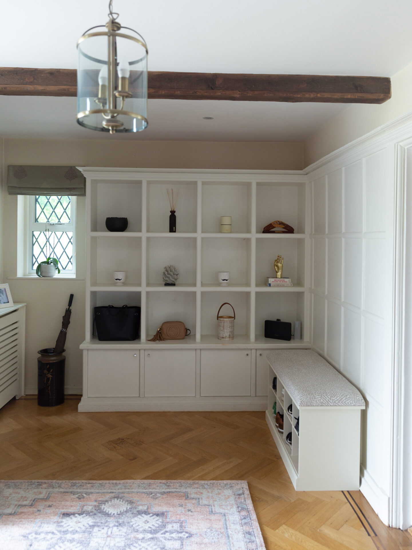
We were lucky to inherit this built-in hall storage. It looks great but isn’t really big enough for our needs (which is why we might redo it at some stage). The boxed shelving serves a more decorative purpose, although I could place some Ikea storage baskets in it to make it a bit more practical. I love the look so I won’t do anything just yet. I’m going to live with it a little longer to see how we could make most of this space. There’s so much potential to do something cool (and more practical) with it.
S H O E B E N C H
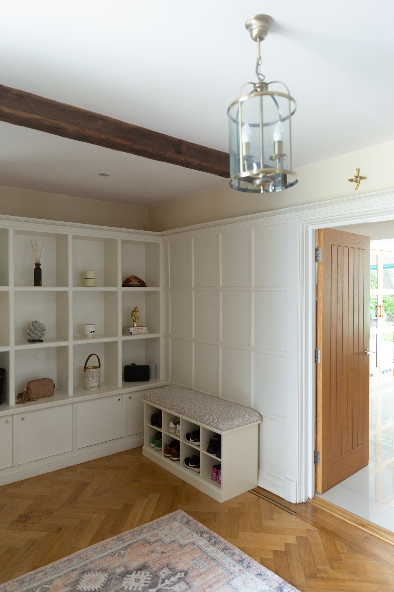
This little corner was craving a bench. And what could be more practical than a shoe bench?! It needs repainting to match the rest of the walls/furniture but other than that it’s perfect. I ordered the Bruton shoe bench from the Dormy House and it took almost 6 months to arrive. It was well worth the wait though. I added an upholstered seat pad to the bench in taupe colour (pattern Cairo). I love the fabric so much that I’m thinking about getting identical blinds custom made. The bench isn’t attached to the wall. It just leans against the wall and doesn’t move. It’s ideal for a semi-permanent storage solution, although I’m hoping to have a proper built-in bench here one day when we rejig the modular shelving unit.
A N T I Q U E B R A S S C O A T H O O K S

I’d love to have a bigger coat storage solution one day but for now, we’ve put up coat hooks on the cloakroom door. There’s not a lot of room to store many coats (especially for a family of four) but I love the way it keeps them all tucked away. The antique brass hooks are from Nkuku.
P A T T E R N E D R U G

I’ve been looking for the perfect rug here since the day we moved in. I knew I wanted a rug with a pattern as they are so much more forgiving in a hallway. I wasn’t quite sure what colour and material though. I looked at natural rugs, like sisal, but in the end, decided on a cotton/synthetic mix. Hall rugs need to be hardwearing and practical. And of course, help you achieve that ultimate first impression. I spotted the Triple Medallion Heirloom rug on sale at West Elm and I was sold. I also bought the rug pad to keep it firmly in its place. The best part is that our robot hoover can go over it without any issues (a real ‘must’ in my book).
O R I G I N A L B R I C K F I R E P L A C E
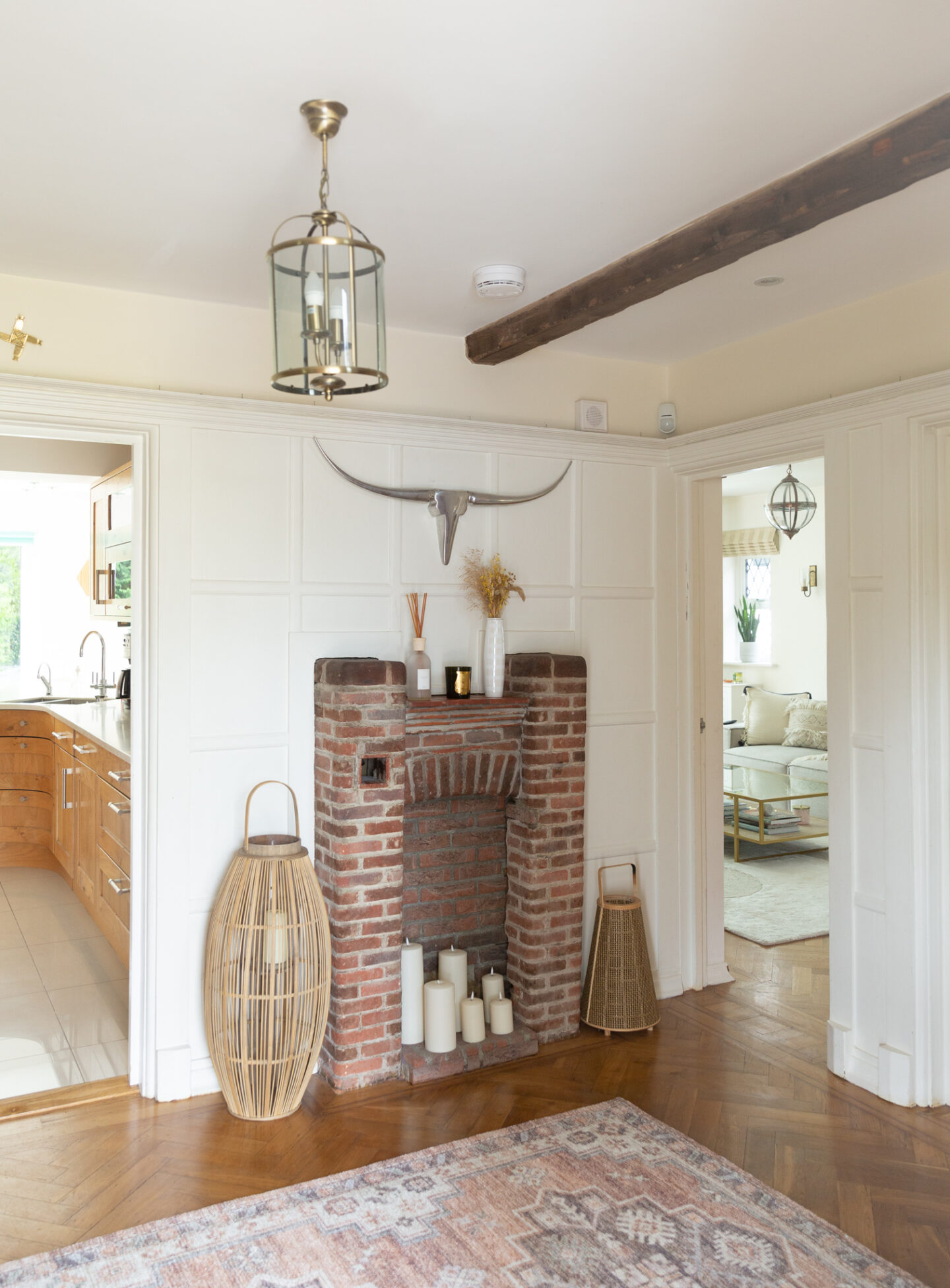
We are in the process of redesigning one of the original fireplaces in this house. I know, such a faux pas, right? But sometimes the original features need to go, or at least be modernised. I’ll write a blogpost about this soon, but we are still keeping one original fireplace in this house and that is the one in our hall. I like the idea of having at least one as it adds so much character and history to our house. Luckily this brick fireplace is on the smaller side, so it’s not quite as overpowering as the other two. It adds tons of character and interest to our hallway. I love that it’s the first thing people see when they come in. It could do with a bit of TLC but we are leaving it as it is for now. The brick effect looks great with the new rug and the boho lanters. I feel like it pulls the whole look together. I placed some pillar candles in the chamber to give it a faux fireplace effect. I love the look of real candles but much prefer the convenience of LED candles, especially as these come up with a timer. The oversized rattan lantern is from Connox and I found the smaller one in an Antique shop in the Cotswolds.
T H E R O U N D M I R R O R

And last but not least, our old round Evie mirror looks right at home in our new(old) hall. It’s a perfect size here and looks ideal above the radiator cover/side table. It brings more light into this corner and makes it appear more open and relaxing. I love that it’s such a simple design in a pretty busy space. The panelling and the fireplace are pretty dominating, so it made sense to keep all the other details quite sleek and minimalist. The radiator cover doubles up as a handy side table. I might paint it at some point, or I might not. I honestly don’t know how this room will end up looking. That’s the beauty of decorating. I don’t think I’ll ever be quite finished. I’m fully expecting this space to evolve and grow with us.