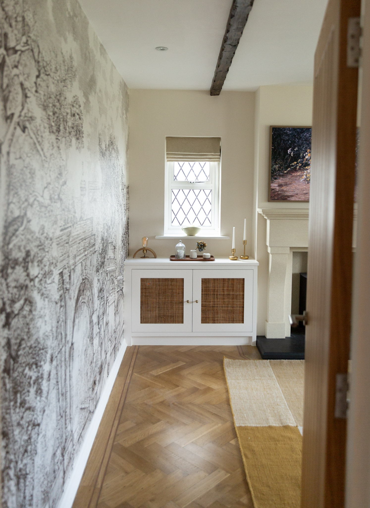
*In collaboration with Graham & Brown.
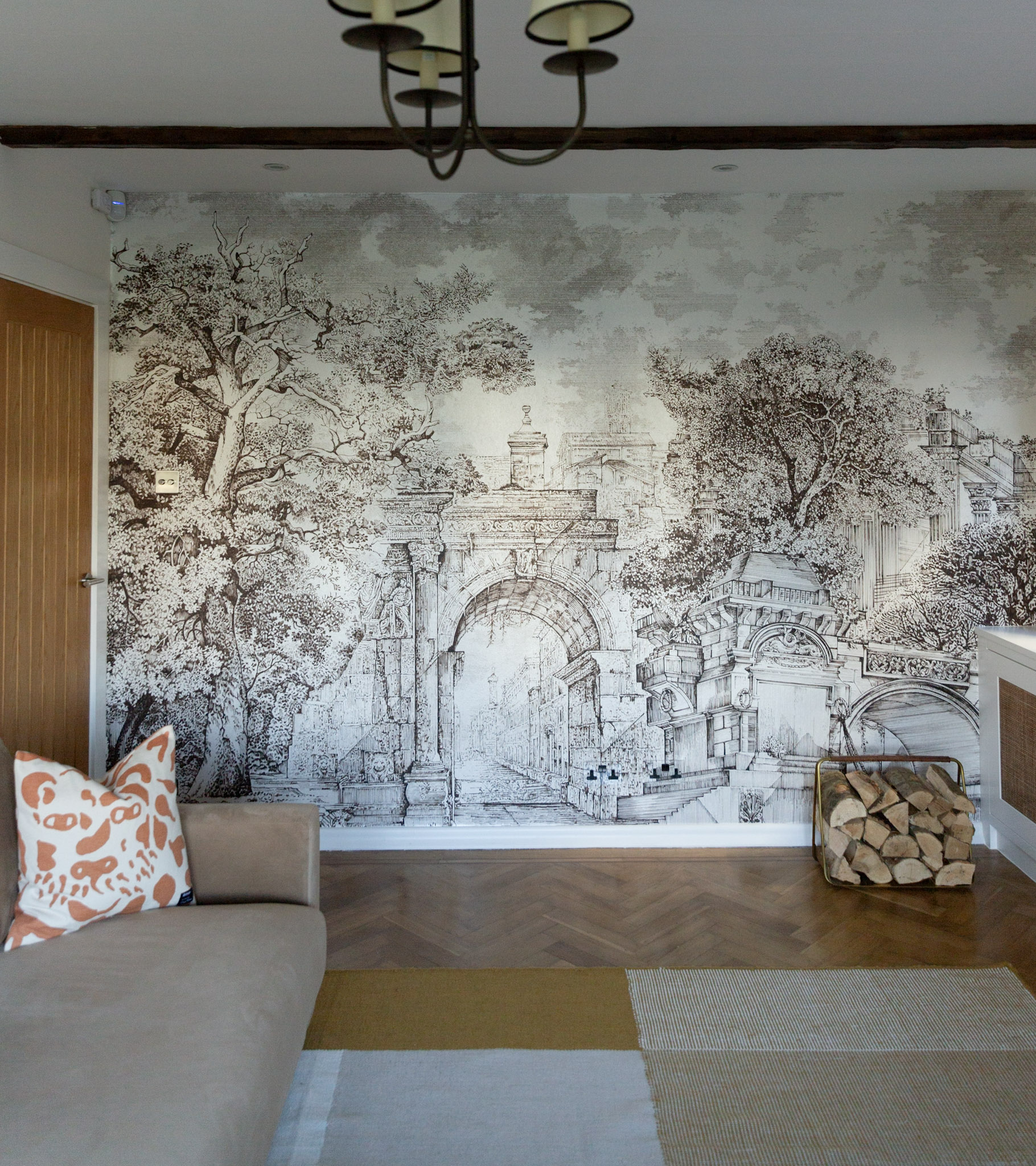
Love them or hate them, sometimes feature walls are not just a good idea, they are a necessity. Nothing transforms a room quite like an accent wall, whether wallpapered, painted or paneled. It’s a simple update that can turn your blank wall into a masterpiece. That’s probably why we have so many in our house. I guess you could say I’m a bit obsessed with them. I particularly love a feature wall with oversized proportions. Repeat patterns in a feature wall just doesn’t work for me; make it big and bold instead. And our latest has certainly exceeded my expectations. I saw the majestic Rivington Folly mural at the Graham & Brown pop-up shop in London a few months ago and fell in love. Sophisticated and architectural, it is more like a piece of art, which is what I wanted for this room.
Let’s have a look at the before picture.
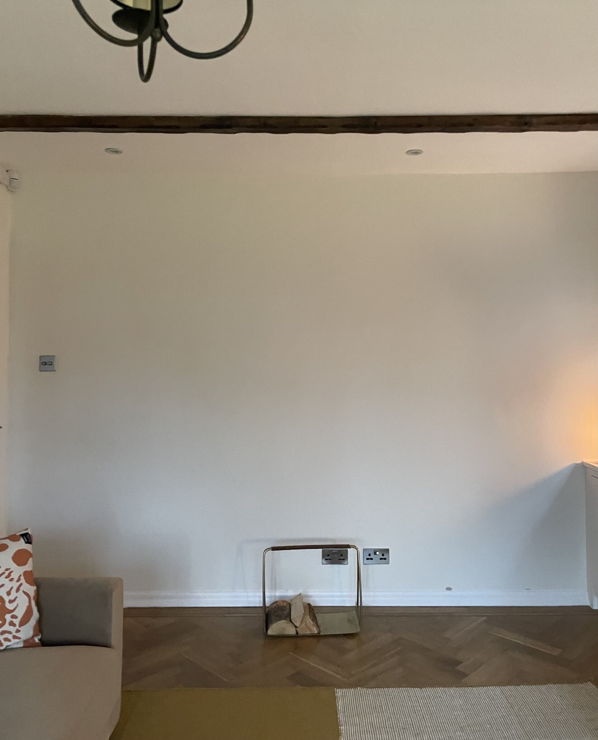
All this whiteness is blinding me. The TV used to be on this wall and it didn’t look pretty. Thankfully we got rid of it as soon as we started the reno. It’s one of my biggest pet peeves when people put their TV on the biggest wall they have. I mean why? Unless you’re trying to turn your room into a cinema, give it a miss. It wasn’t very practical in this spot either. Facing the window means that there is a constant glare going on. The best thing we did was to move the TV over the mantelpiece. Of course, it wasn’t quite as simple as that. We replaced our old brick fireplace with a limestone one and put a Samsung Frame TV above it (to make it look more like a piece of art). Annoyingly, that left us with this big blank space that needed some kind of a miracle. I thought about painting the wall in a different colour, but I felt that the room needed a bit more drama. Everything was so muted that the wow factor was missing. Luckily, it didn’t take me that long to find exactly what I was looking for.
RIVINGTON FOLLY BESPOKE WALL MURAL IN COLOUR DUSK
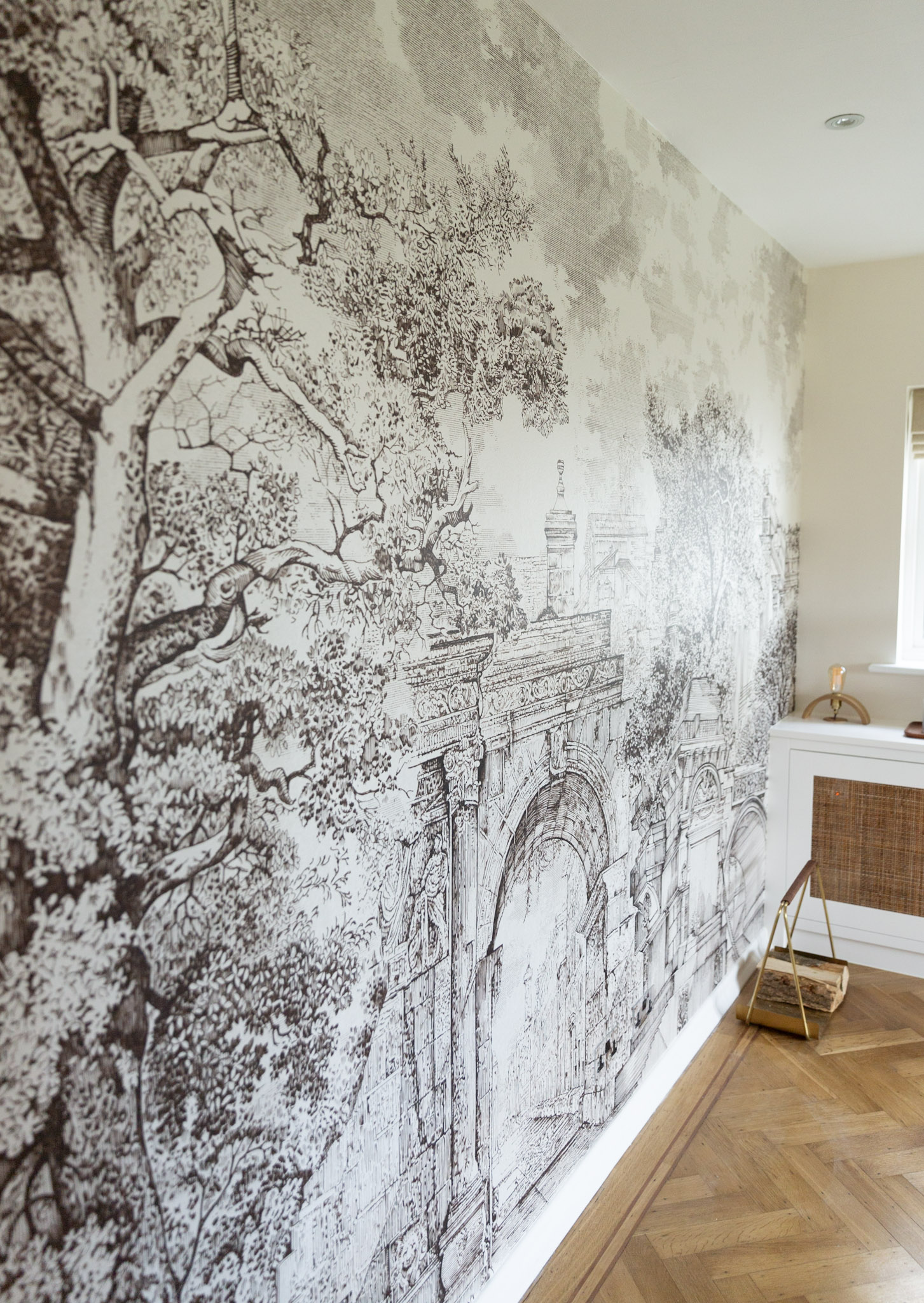
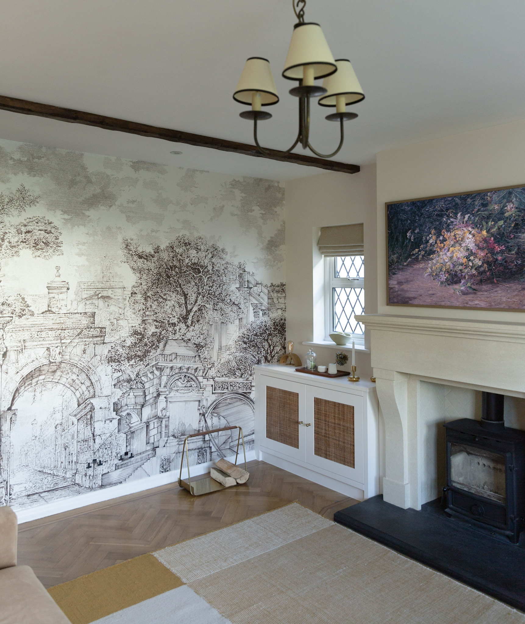
As I said, I spotted this wall mural at the Graham & Brown pop-up shop in London and the rest is history. It’s from their brand-new collection, which looks even more striking in person. Inspired by the Rivington Terraced Gardens, the wall mural is available in a range of muted, earthy colours and various finishes. They even do a repeat pattern wallpaper for the same collection. The moment I saw it, I fell in love with those old trees and grand architecture.
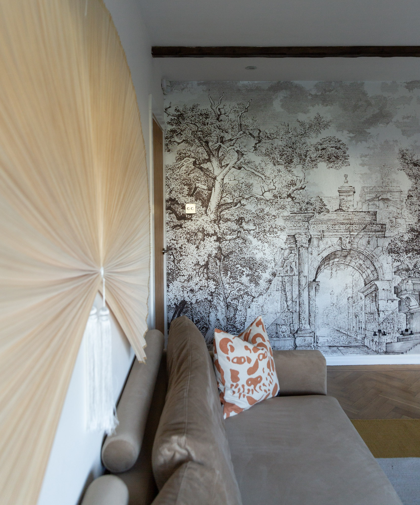
I chose the colour dusk, which is essentially black and brown with a beautiful metallic sheen. The trees and the dramatic landscape are a perfect match for our 1920s house. I ordered some samples first to see how the different colours and finishes would look in our north-facing room. The colour scheme in the room is all about earthy tones and browns, so choosing the right colours to complement this was essential. I love that Graham & Brown’s website now has a new ‘see it in your room’ option. This allows you to see how the mural would look in the room before purchasing. So handy!
INSTALLATION & QUALITY
Our decorator was already familiar with Graham & Brown wallpapers, which made the installation a breeze. He said the paper was amazing to work with. You can tell it’s a good quality wallpaper just by the thickness and texture of it. Since this is a bespoke wall mural, we added additional 10 cm for height and width as a margin of error. I’m so used to irregular walls in this house that I didn’t want to take any chances. Also, don’t forget to switch off the radiators in the room when you are installing the mural. The heat can cause the paper to dry too fast and shrink. We left our radiator off for 3 days to make sure that the mural had dried properly. We decided to use lining paper underneath to make sure the finish would be superior and durable. All in all, it took two days for our decorator to complete the feature wall, which I thought wasn’t too bad. The finish is absolutely perfect and the wall mural looks even better than I could have ever imagined. The hand-drawn pattern is so realistic that it does not look like a digital print at all.
HIDING THE PLUG SOCKETS

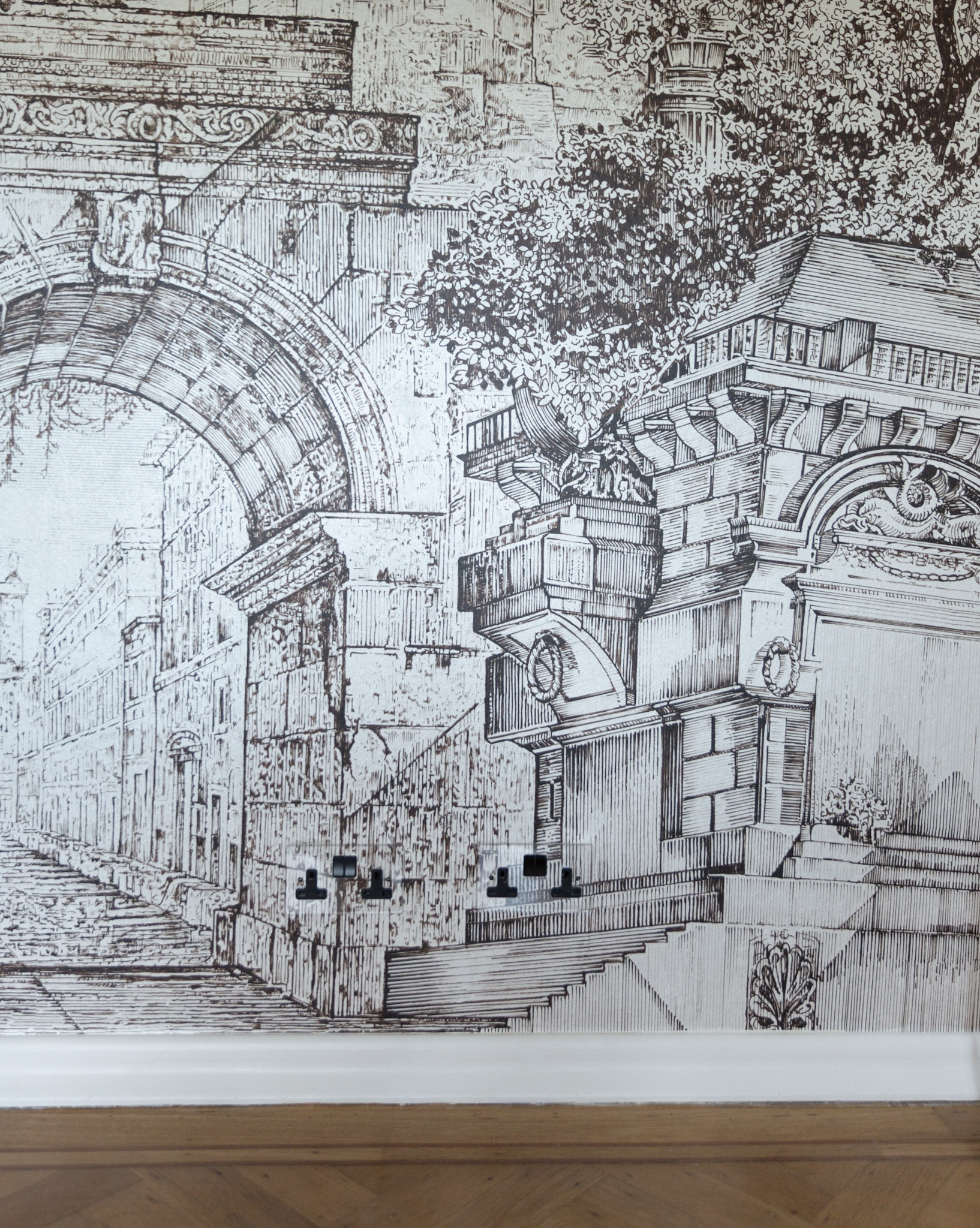
We did have one challenge though. Hiding the visible sockets in the middle of the wall was essential. The shiny metal plates stuck out. My husband wanted to keep the sockets in case we ever wanted to put a table there, so I had to find a way to hide them. Luckily, I remembered that Corston had just launched a new range of see-through plug sockets that could be painted or wallpapered. Our decorator glued the wallpaper into the plates and now they blend in perfectly. You have to be very careful when cutting the paper and use the templates that come with the sockets. The clear sockets are such a great idea that I will definitely buy more for the house.
WHAT’S NEXT?
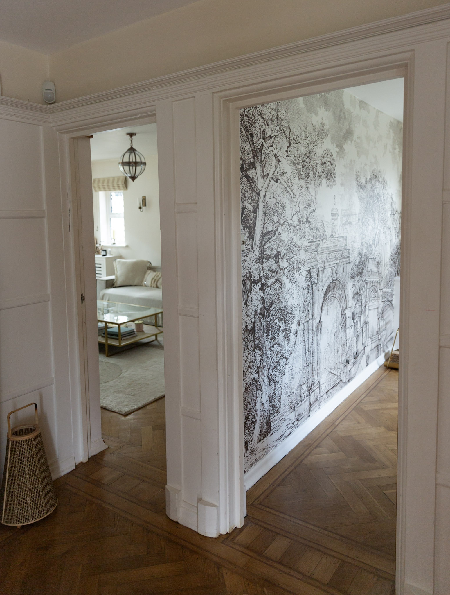
Although this room is now officially finished, I’m sure I’ll make some updates at some point. I love the feature wall too much to put a console table or chair to cover the beautiful mural, but I wouldn’t rule it out entirely. A table would be purely aesthetic, but the chair could be very practical. Or maybe I should just leave the wall alone and admire it every time I get a glimpse of it. What do you think? Should I leave it alone or add a chair or a small side table?
Let me know what you think by leaving a note in the comments section below!
