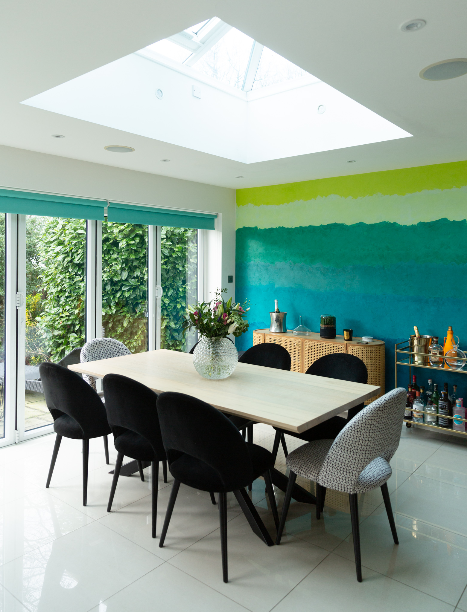
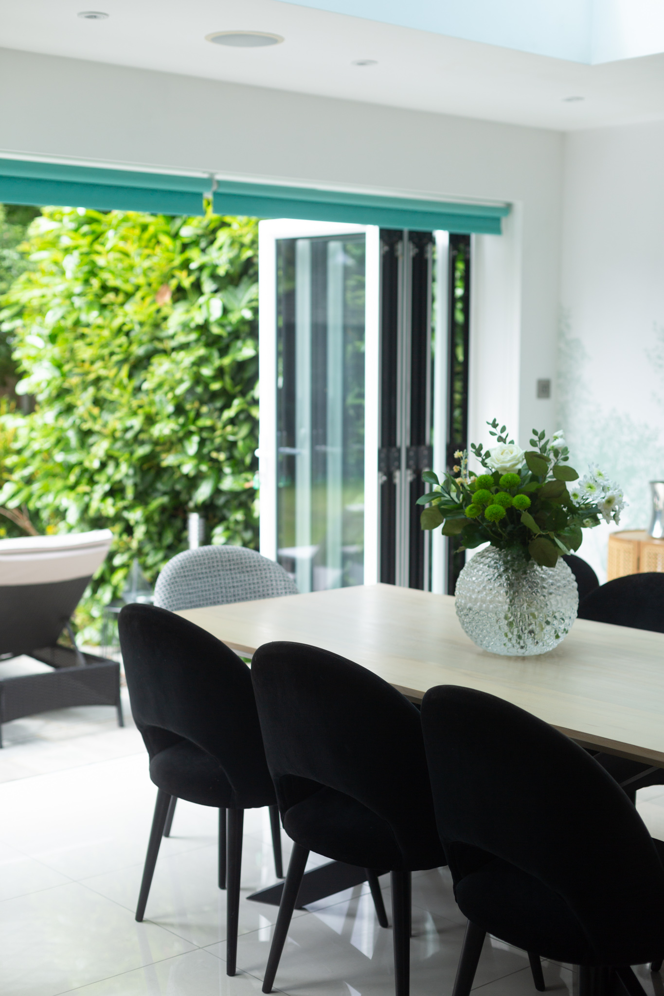
It took me almost a year to finish our dining room make-over but oh my was it worth it. I absolutely adore it! I loved my old dining room (in our previous house) so much that I didn’t think it was possible to love this one even more. I’m so grateful the previous owners went through the hassle of extending this room. The dramatic raised glazed lantern roof window opens it up and adds tons of light. I even liked their choice of tiles. You can’t go wrong with white porcelain tiles in a south-facing room, can you? The only part I don’t get is the underfloor heating. It’s really not necessary. This room gets hot, which is why we have bi-fold doors throughout. The doors are open most days during the summer. It feels like an extension to our garden which I love. One thing I did change was the old feature wall. You can read more about it here but changing that colourful painted wall made this room feel like a lot more like ‘me’.
Here’s what the room looked like before..
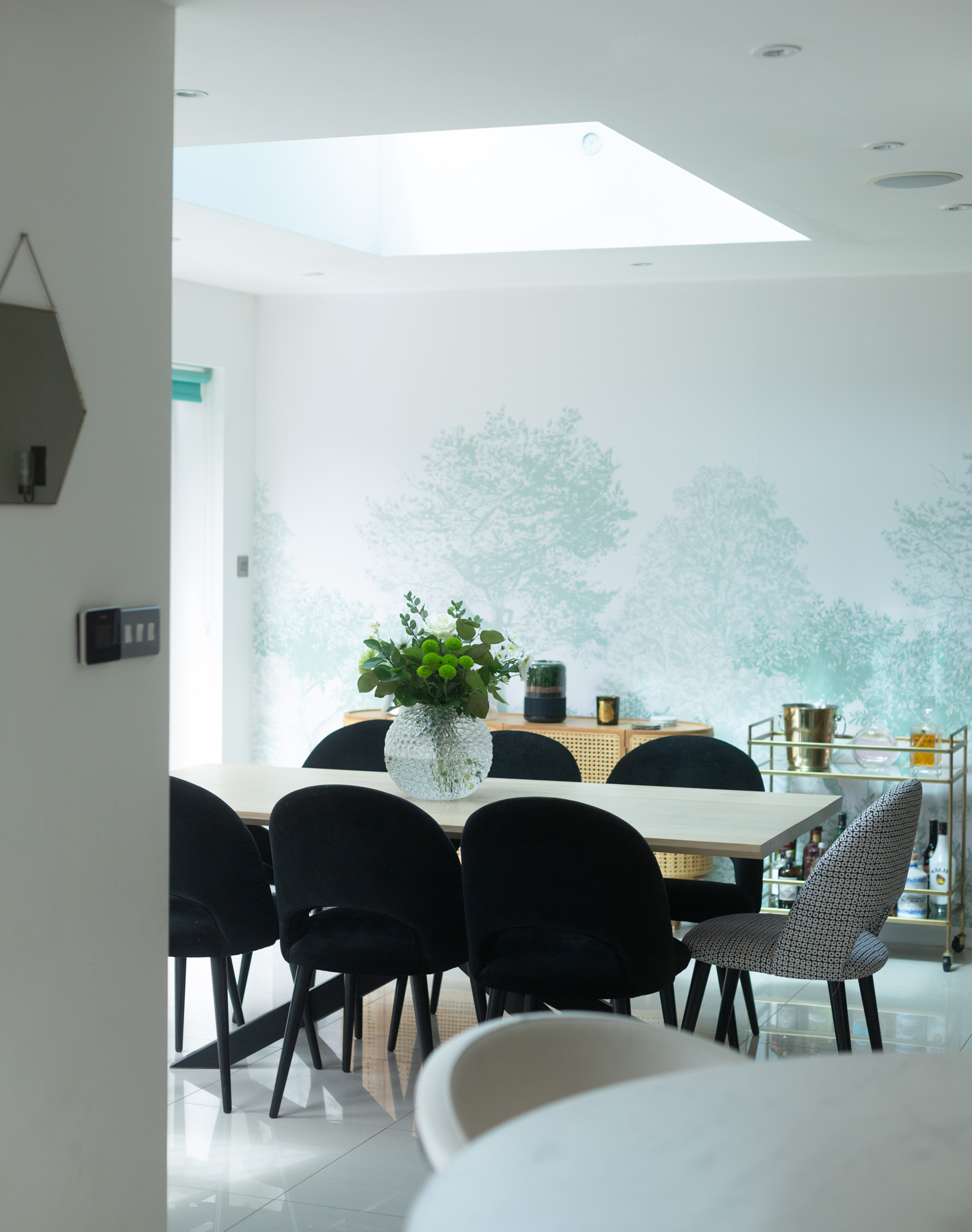
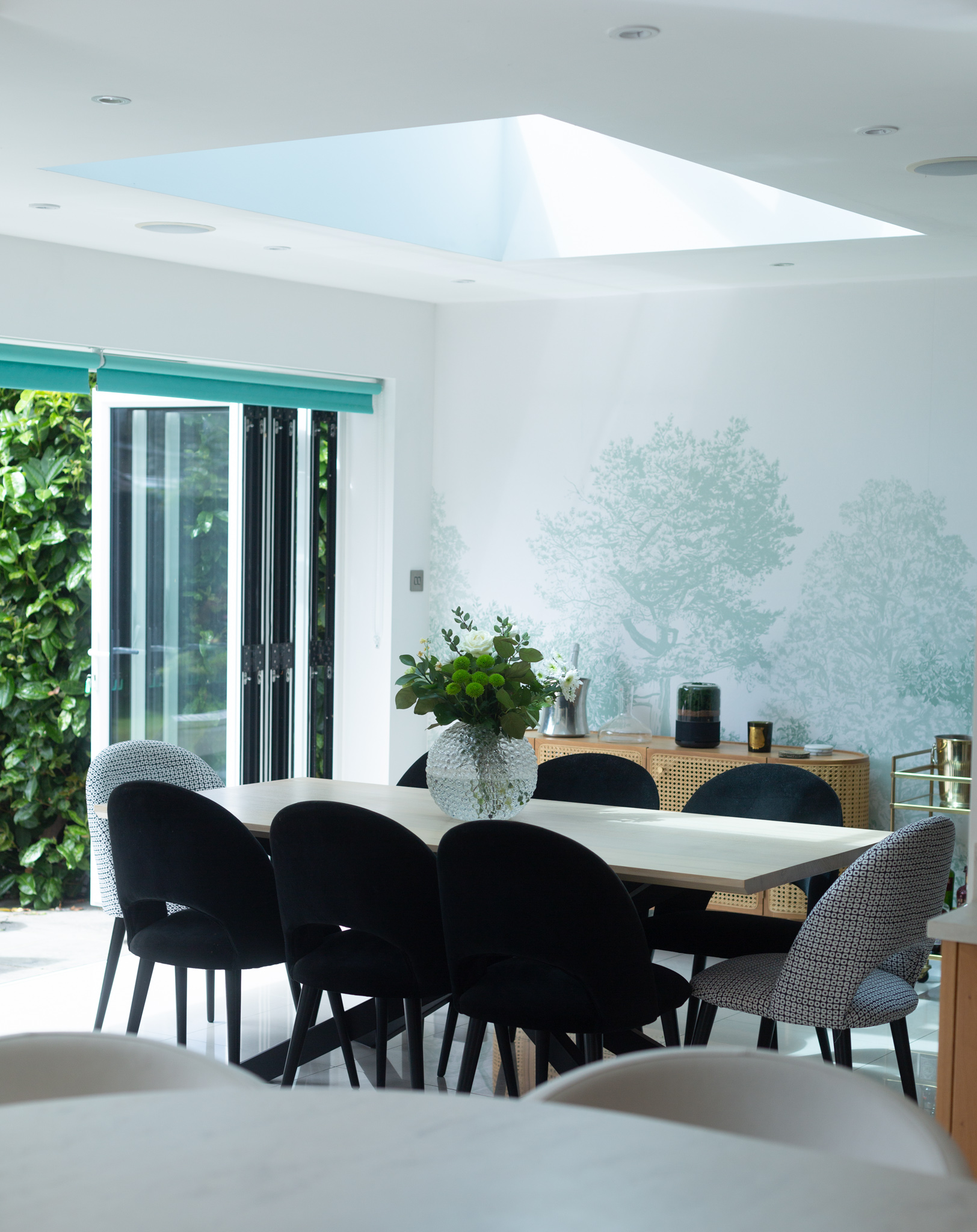
And after!
T H E V I E W
My favourite part about this room is that I can see our dining room from the kitchen. It’s all very open-plan but still feels separate, if that makes sense. I’ve never had an open-plan kitchen before so this has been life-changing. It’s so nice to be able to see the guests when you’re entertaining and still have the dirty dishes tucked away thanks to the semi-circular island.
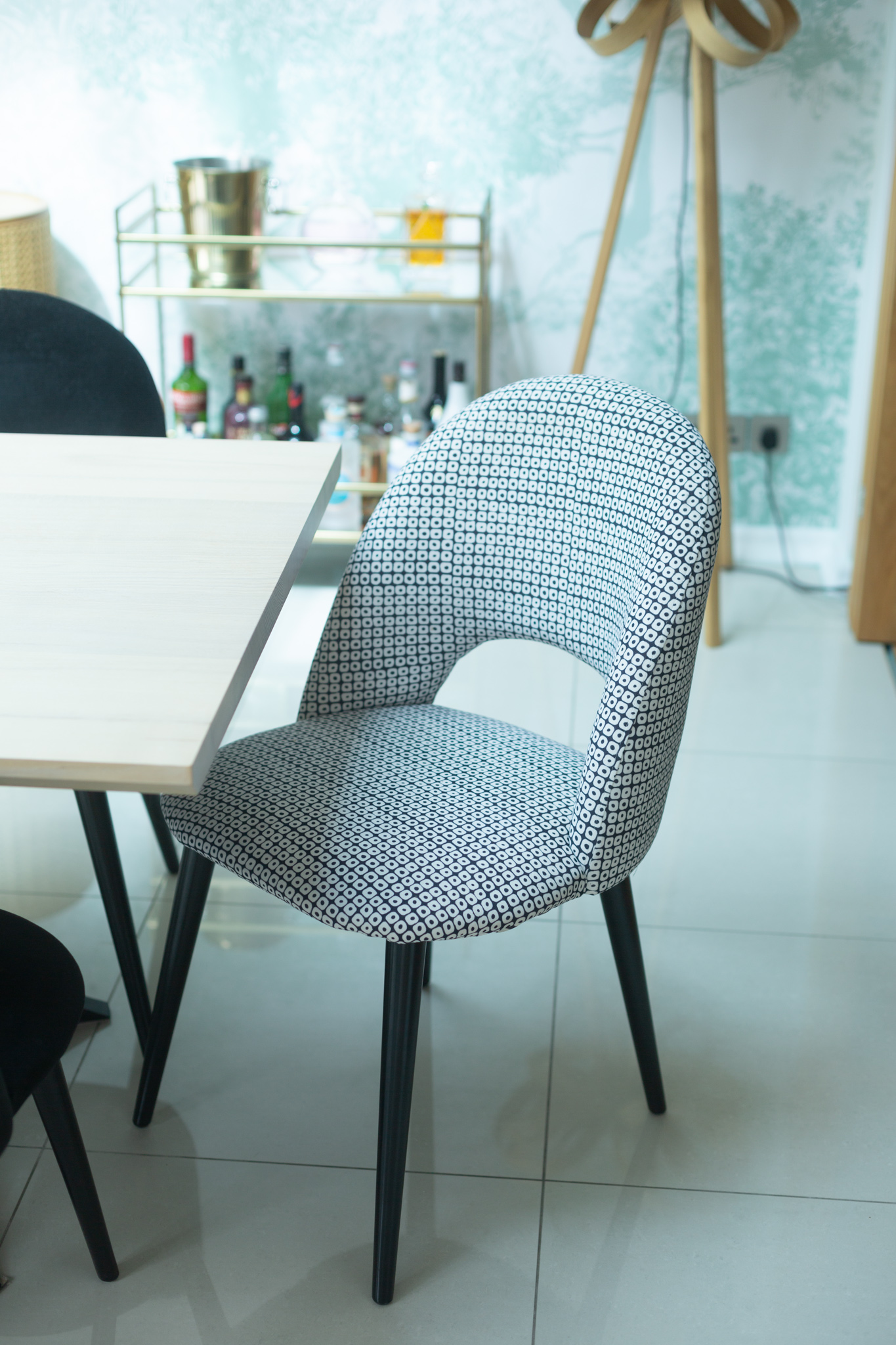
W O O D E N D I N I N G T A B L E & C H A I R S
One of the first things I measured when we viewed this house was the dining room. I had just bought my dream dining table a year ago and it needed to fit. Well, I’m not saying if it didn’t fit I wouldn’t have bought the house but it was a sign for sure. And the table goes in perfectly here by the way. Not just from a technical point of view but also aesthetically. I love the contrast of ash against the oak accents in the house. The velvet chairs from Maisons du Monde add a bit of drama to the interior scheme.
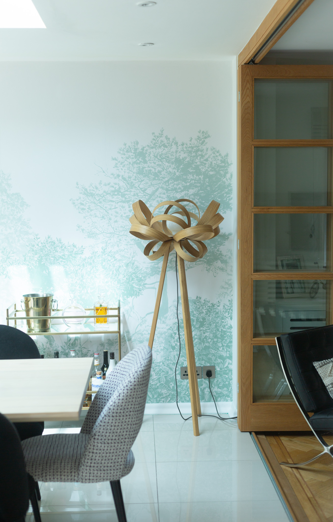
T O M R A F F I E L D S K I P P E R F L O O R L I G H T
I first spotted the Tom Raffield Skipper floor light in the cottage we stayed at Linthwaite House. It is probably the nicest boutique hotel I’ve stayed at by the way. The decor is out of this world. I couldn’t get the lamp out of my head either so when we needed one here I knew it was meant to be. I would love to add more Tom Raffield pieces to our home one day.
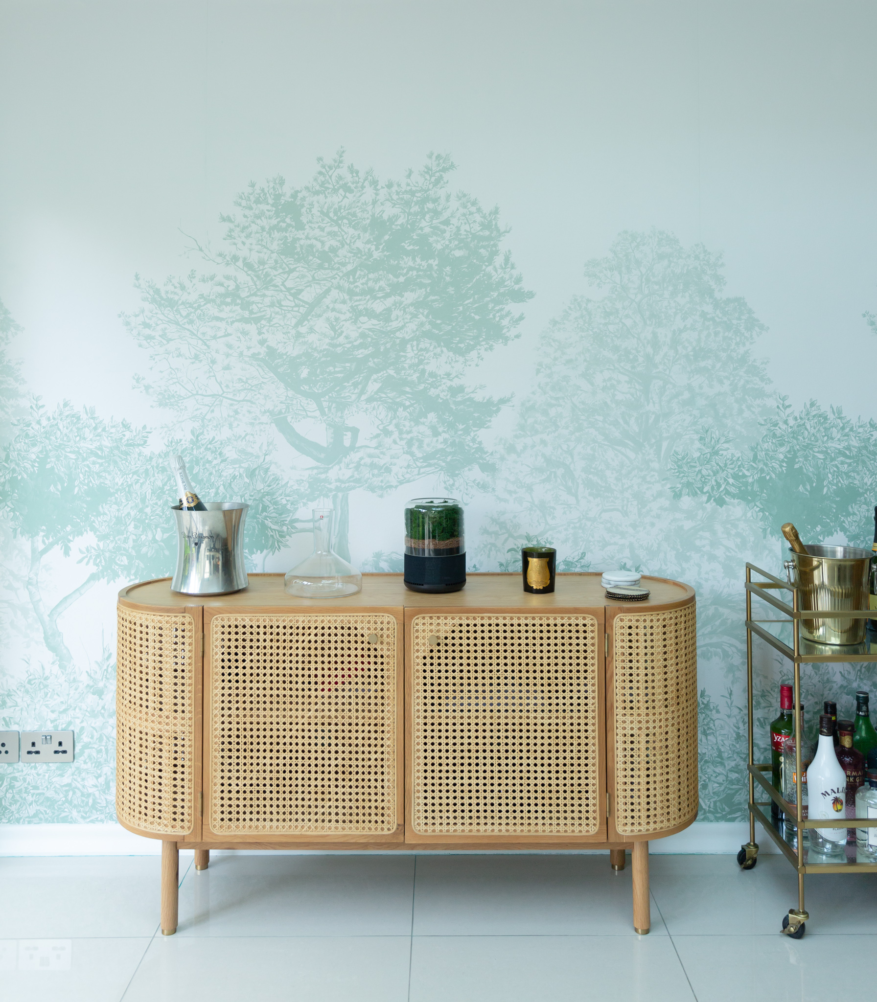
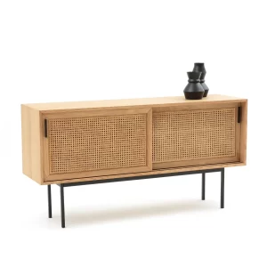
R A T T A N S I D E B O A R D
I’m a huge fan of the natural look that rattan has, plus it’s timeless (despite being very much on trend at the moment). As it turned out, the Ankara sideboard from Made was exactly what I was looking for. It took 5 months to arrive though (yes, seriously) but it was so worth the wait. I love the luxe brass handles paired with oak and rattan. The best part is that it has cable holes to store our Sonos speaker system. Not just a pretty design but super functional too.
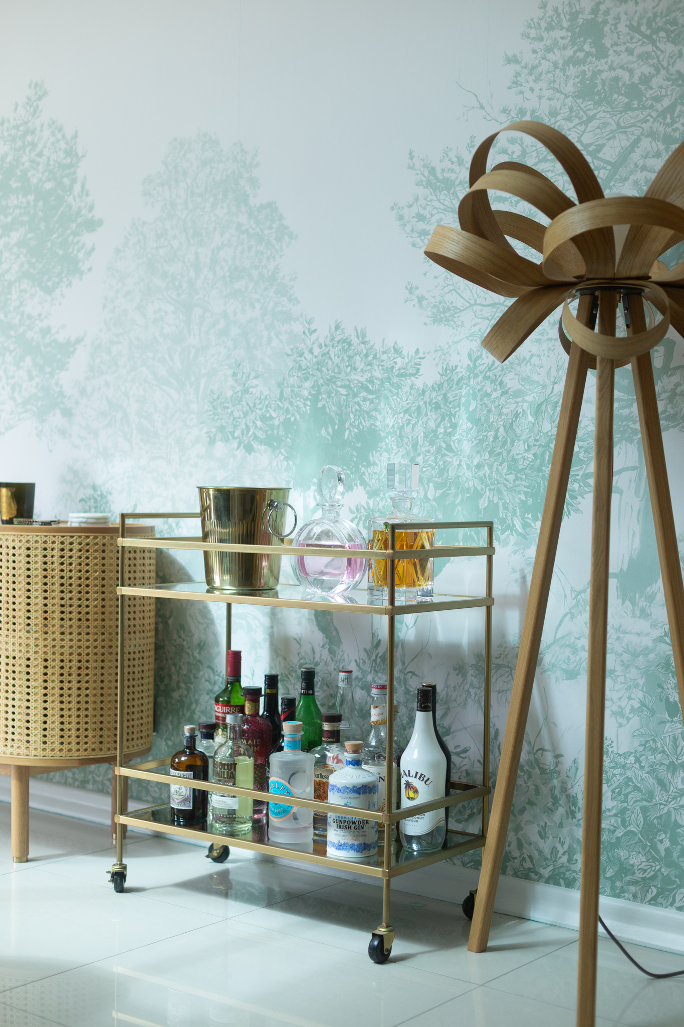
T E R R A C E B A R C A R T
The West Elm terrace bar cart from our previous home adds a bit of glamour to the room. The funny thing is we are wine drinkers, so this bar cart doesn’t get used that often. It’s mainly there for guests and when we’re entertaining. I love it though and it’s perfect for storing a smaller-sized drinks collection.
T R E E W A L L P A P E R
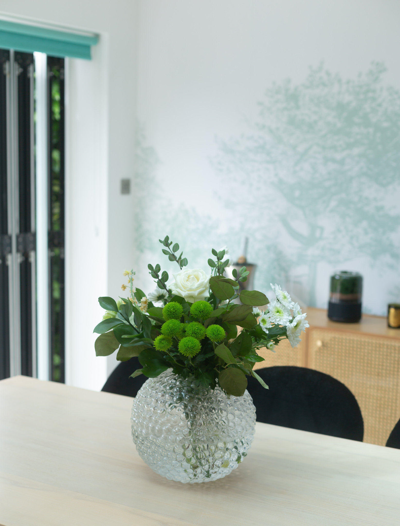
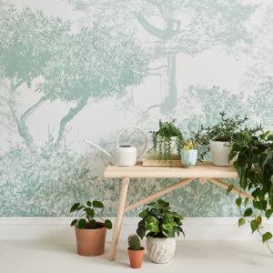
It took me almost a year to find the perfect wallpaper for this room. In fairness, it wasn’t exactly a priority, but I knew I wanted the old feature wall replaced sooner than later. I knew quite early on I wanted a tree-themed wall but finding the ‘one’ wasn’t quite as simple. After months of searching, I finally spotted the Hua Trees wallpaper by Sian Zeng on Etsy. The dusty green colour was the perfect way to bring the outdoors in. Removing the old wall colour wasn’t quite as easy as we thought it would be though. We had to use lining paper underneath, which wasn’t ideal, but honestly, you wouldn’t even know. It looks absolutely perfect. I’ve never been a massive fan of wallpaper but this has converted me. I am actually quite excited about the prospect of adding more wallpaper to our home. And yes, it will keep up with the nature/woodland theme (more about this soon).
That’s it for now. Stay tuned for more makeover posts!




Fantastic job and given me some idea’s to explore. Mama thanks Pia.
Author
Thank you. I’m glad you like it!