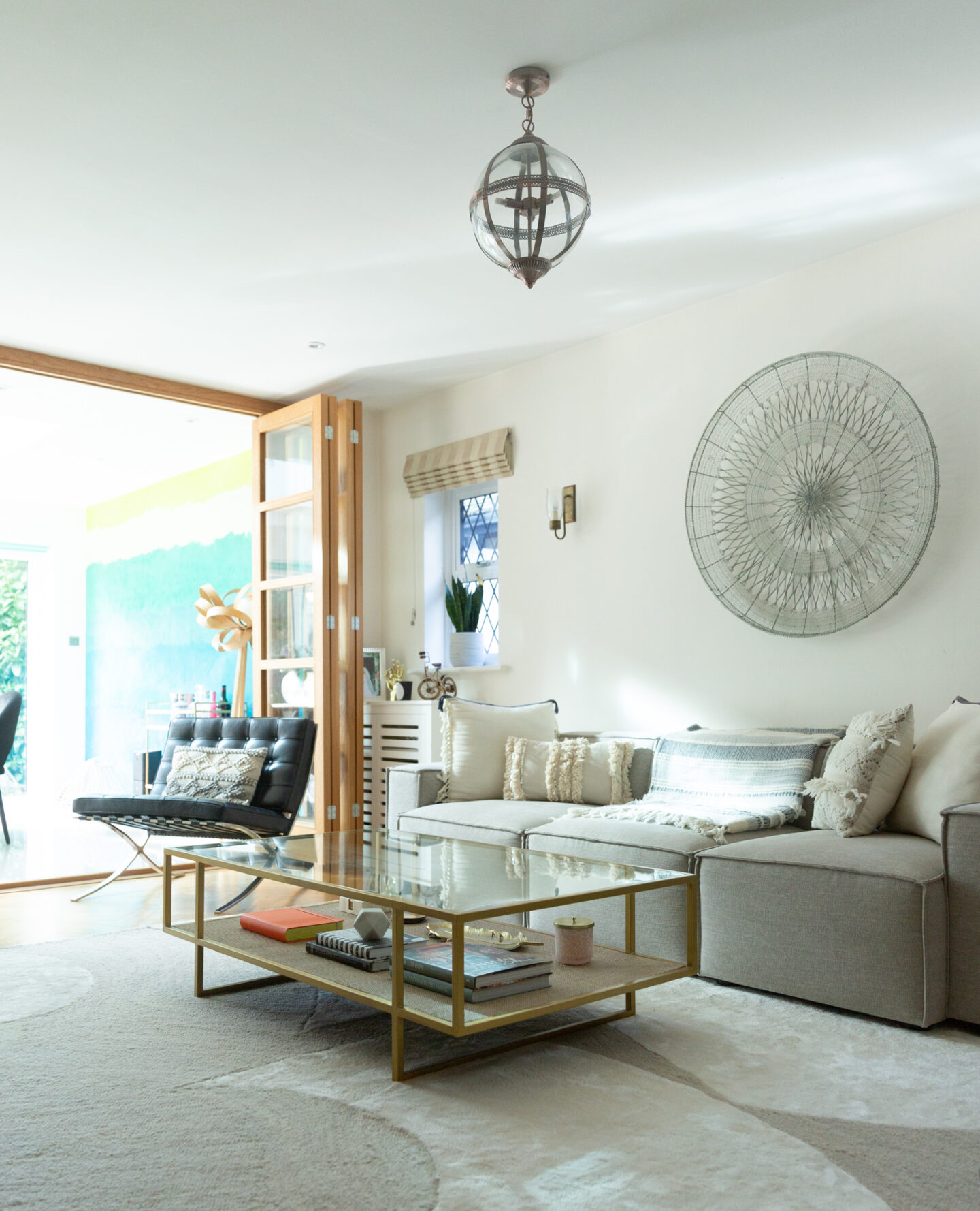
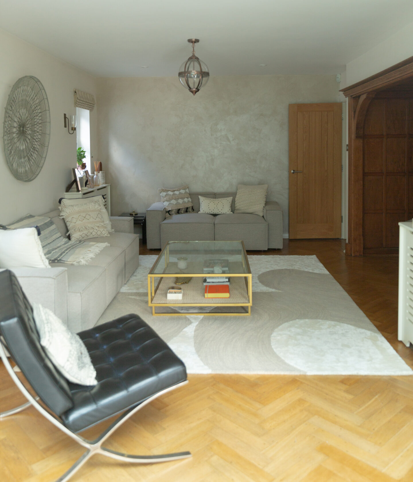
I’m so excited to share our newly decorated living room with you! I should probably start by saying that we didn’t need to do any renovation works whatsoever. We didn’t repaint any walls or change the flooring. It was all perfect when we moved in, which was a total dream come true. The previous owners chose exactly the same colours I would have gone for and I love that they kept the original parquet flooring. Since we didn’t spend any money on the refurb, we got to splash out on the furniture and accessories. I chose my dream coffee table, sofas and the rug to die for (as high maintenance as it is).
I N G L E N O O K F I R E P L A C E
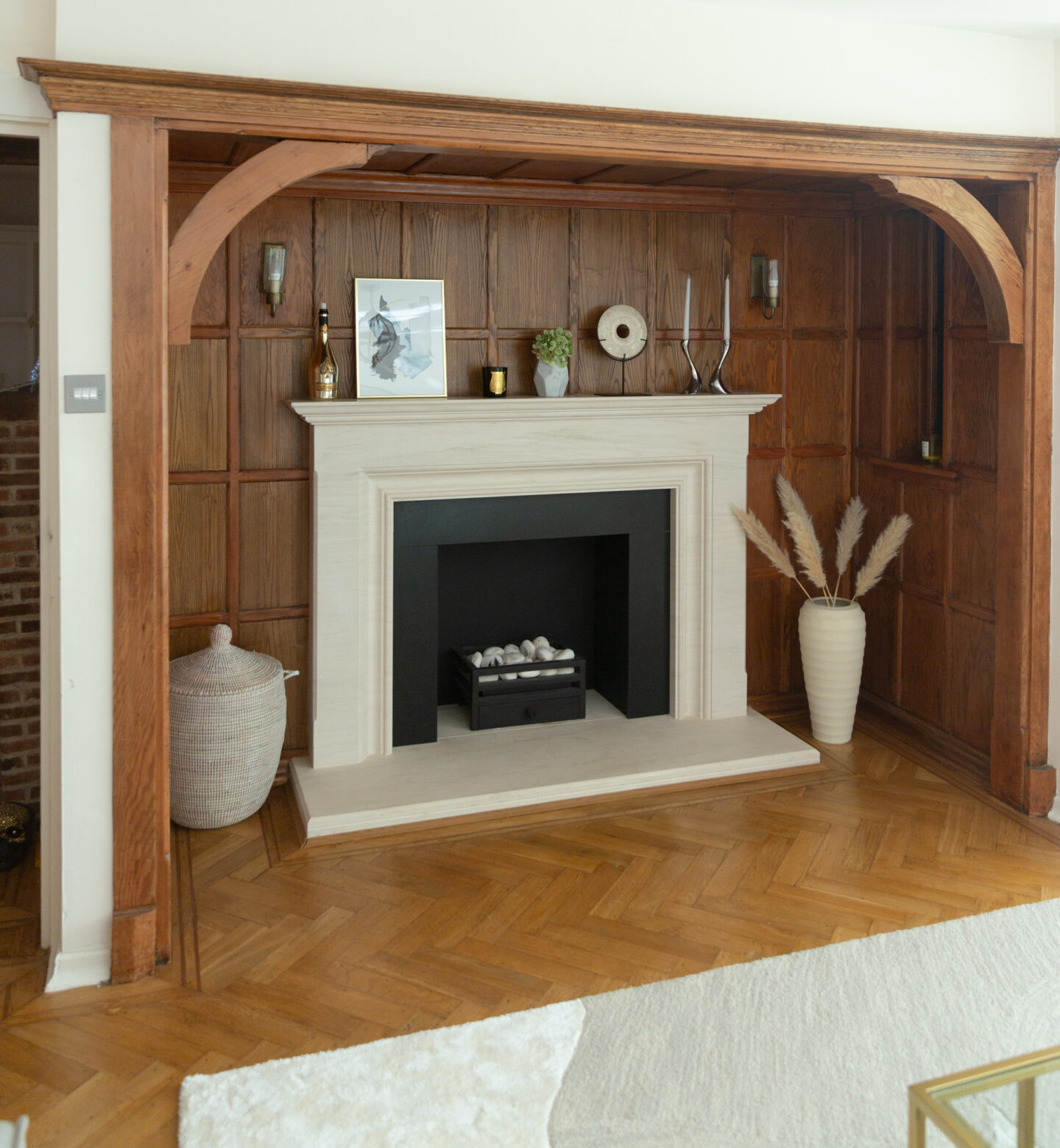
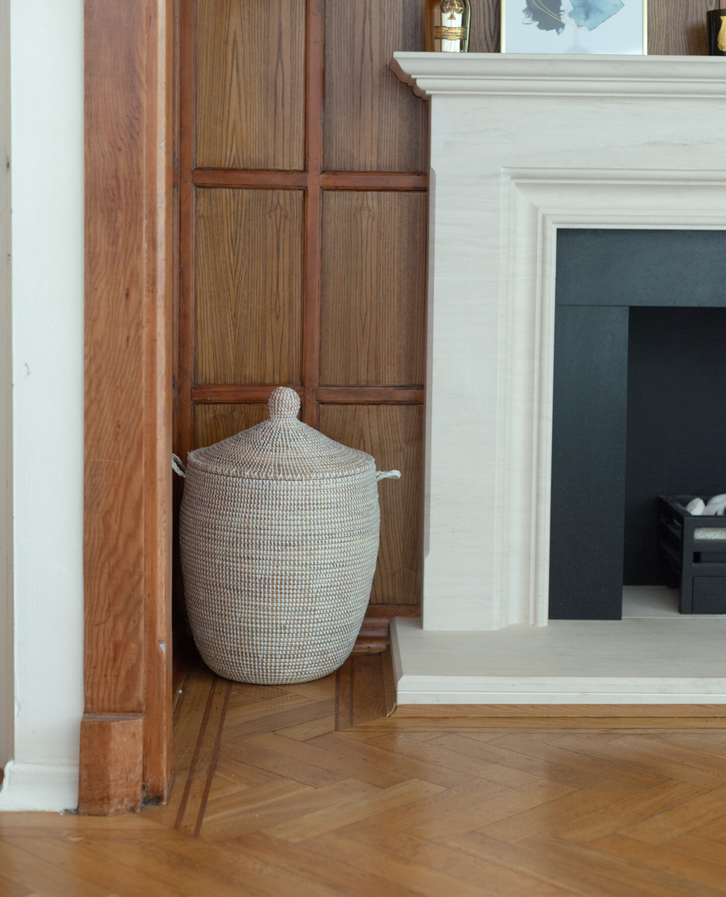
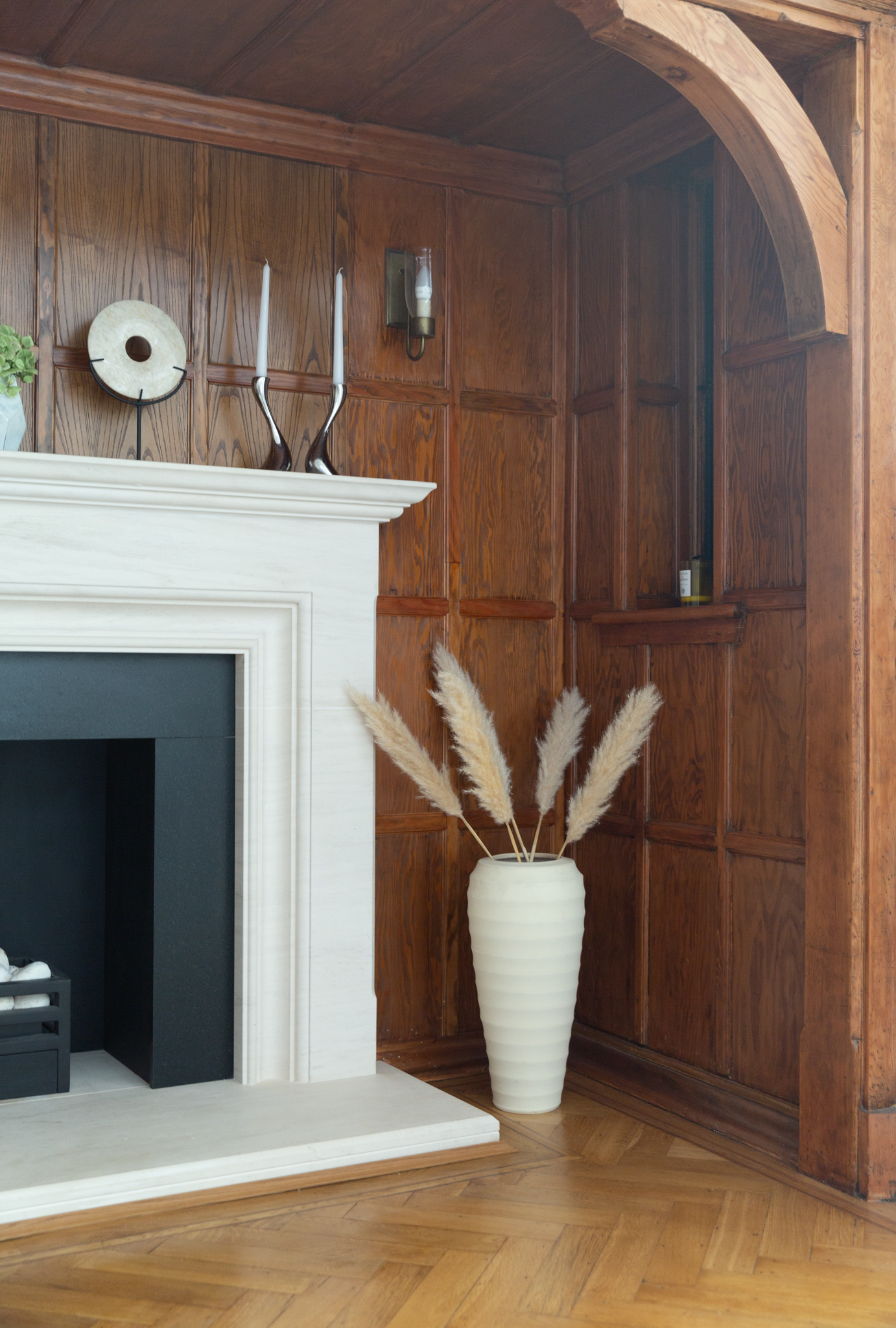
Let’s start with our fireplace, which is the most dominant feature in this room. We call this the ‘fireplace room’ by the way. We have two living rooms and this is the nice, finished one. The other living room will be a much bigger reno project for next year. Our fireplace room is part of the original house. We have kept the original panelling, although previous owners upgraded the old brick fireplace to Portuguese limestone. The fireplace is an original 1920s inglenook fireplace, also known as the ‘chimney corner’. The original fireplace used to incorporate seating around it to keep people warm. Luckily there is no need for seating anymore, but I would never get rid of the panelling. It’s a piece of history and such a feature. The panelling has been lightened to match the oak parquet. I would probably prefer it few shades lighter, but it matches the floors and the doors which is why I think I’ll leave it as it is. The Portuguese limestone fireplace is custom build. It’s pretty big, but it needs to be to fill the space. I’ve gone for white/beige accessories here to brighten the space. This room can get pretty dark, but I love how cosy it feels in the evenings when the gas fire is lit.
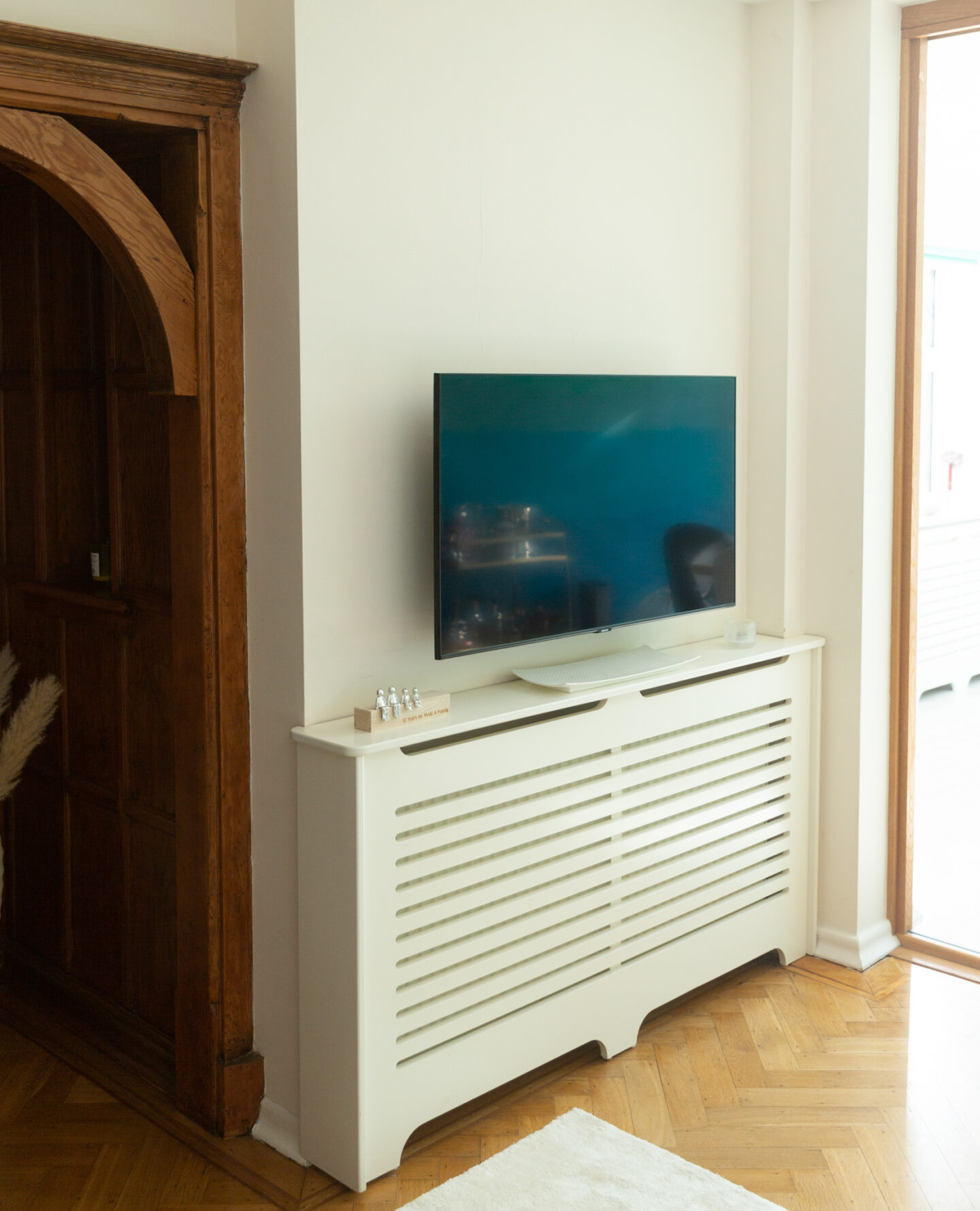
C L E V E R R A D I A T O R C O V E R S
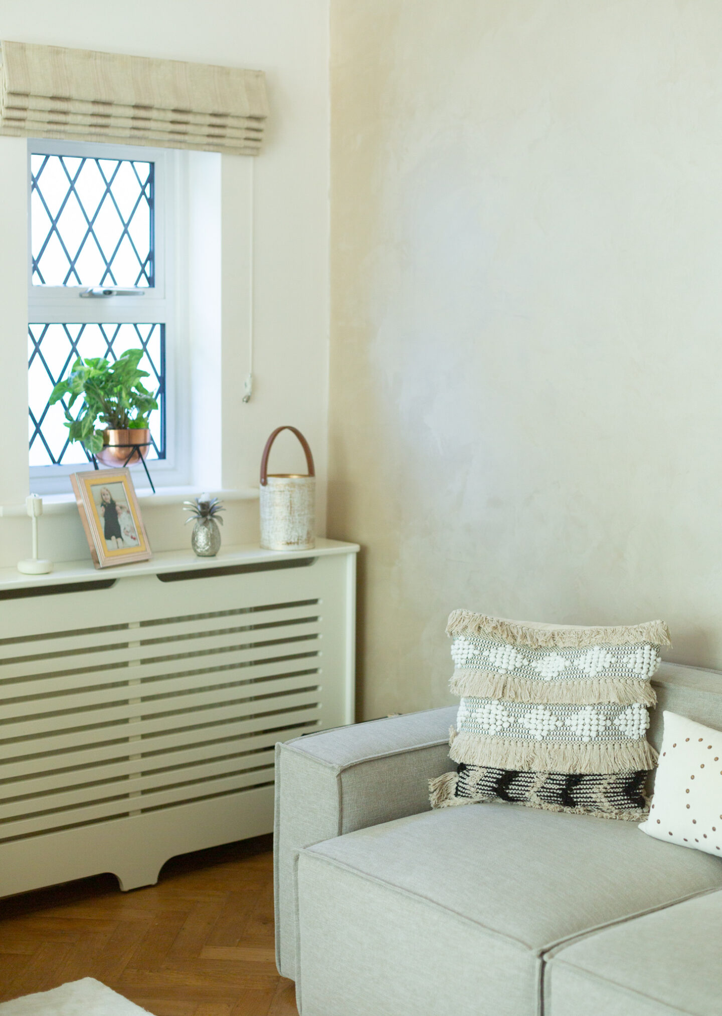
Radiator covers are perfect for hiding ugly radiators. Since this is also our primary TV room at the moment, we’ve placed the TV on a bracket so it can be brought closer and positioned at the right angle.
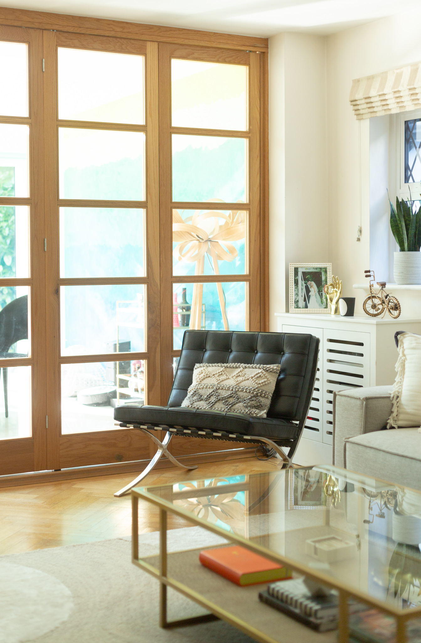
C R I T T A L L D O O R S
Although we don’t use our internal crittall doors that often, they can be very handy. Especially when you’re entertaining, or just want some peace and quiet. The oak frame matches the flooring nicely and they allow lots of natural light to flow in. Crittall doors are hugely popular right now, especially black metal ones. More and more people no longer want open-plan living and see-through crittall doors are the perfect way to divide the rooms without visually blocking the views and light.
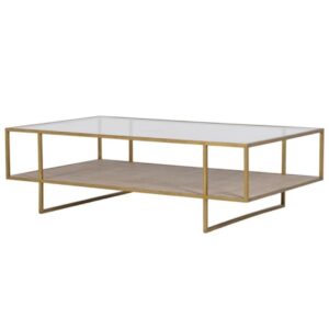
G O L D T W O – T I E R C O F F E E T A B L E
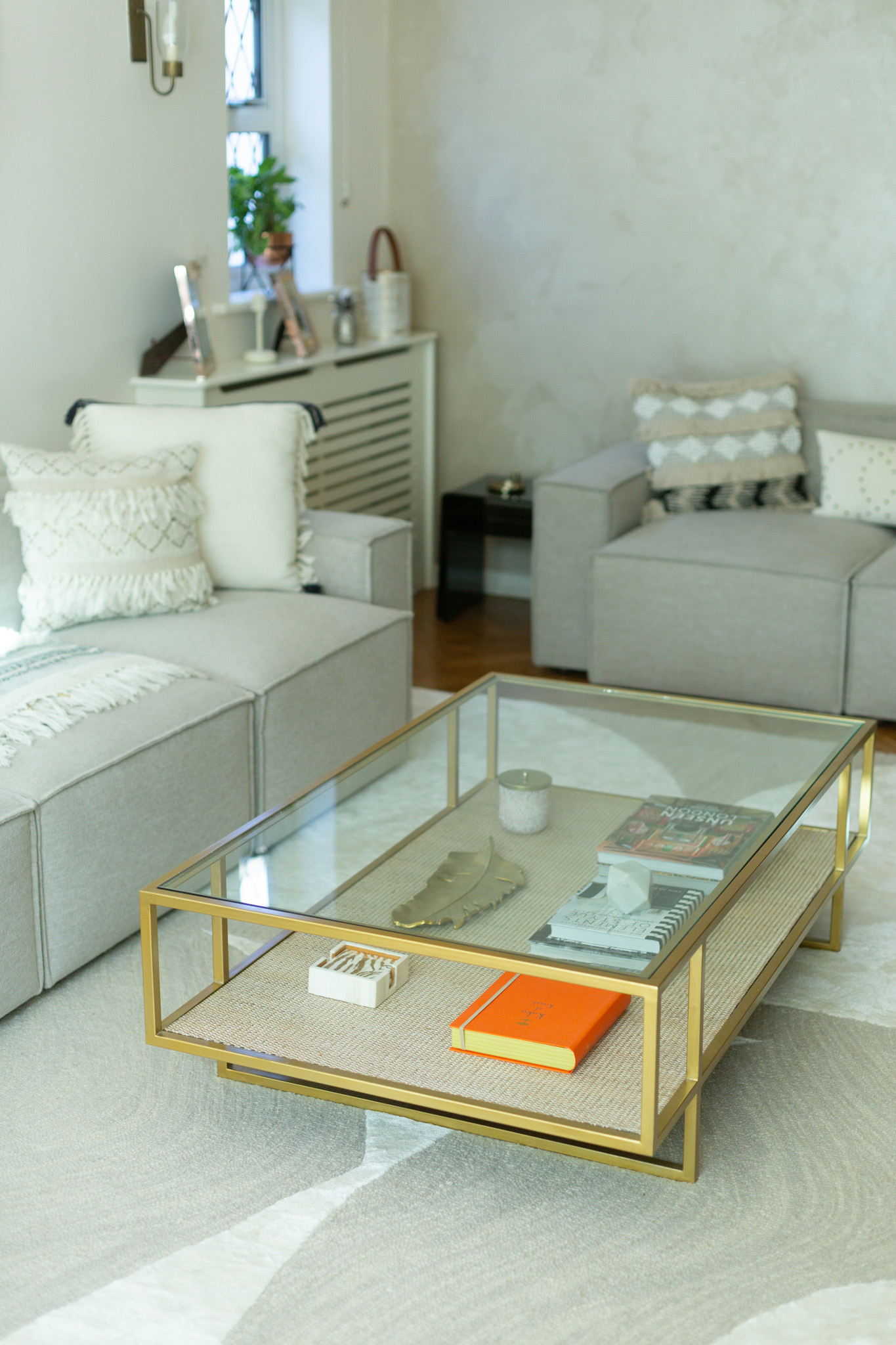
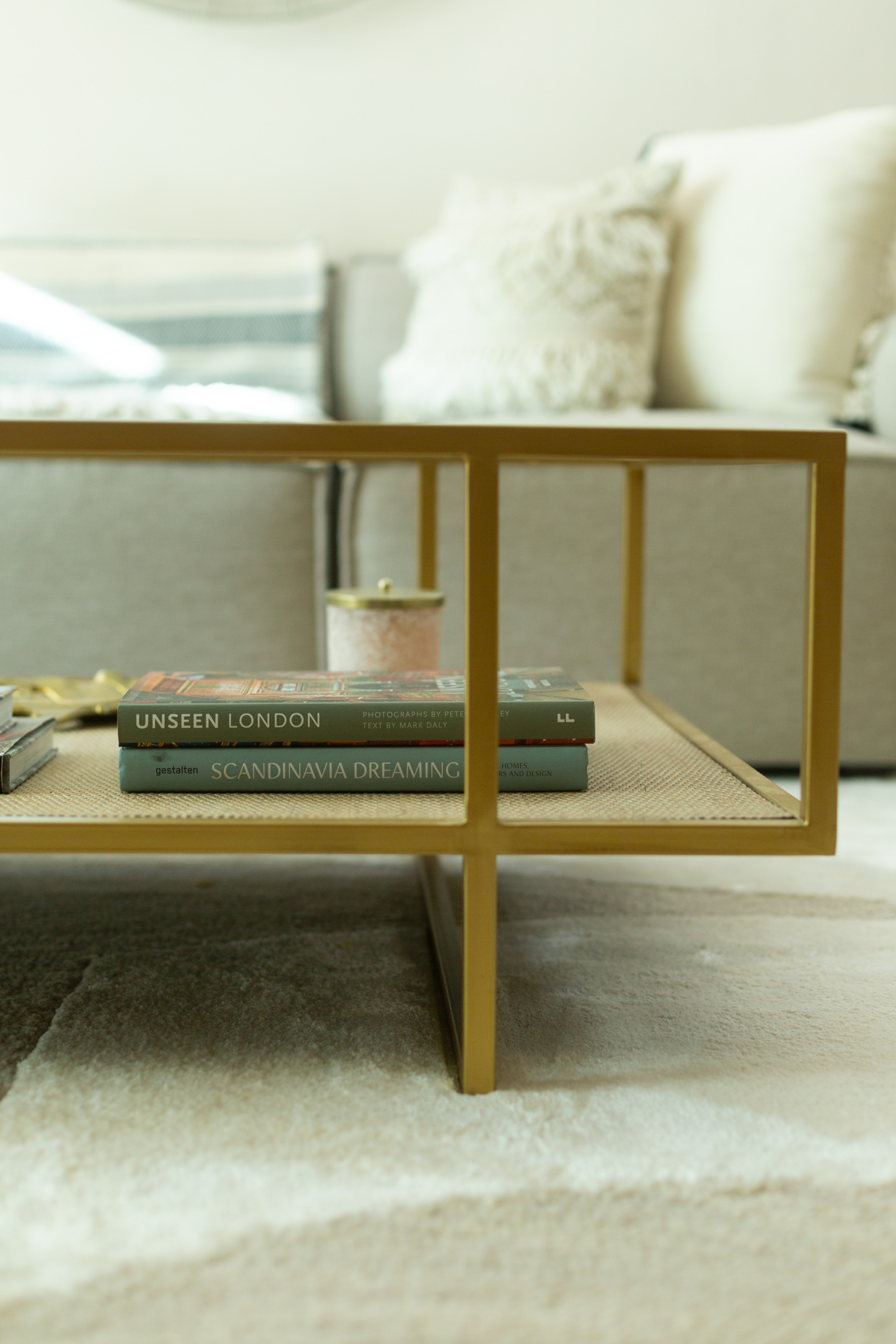
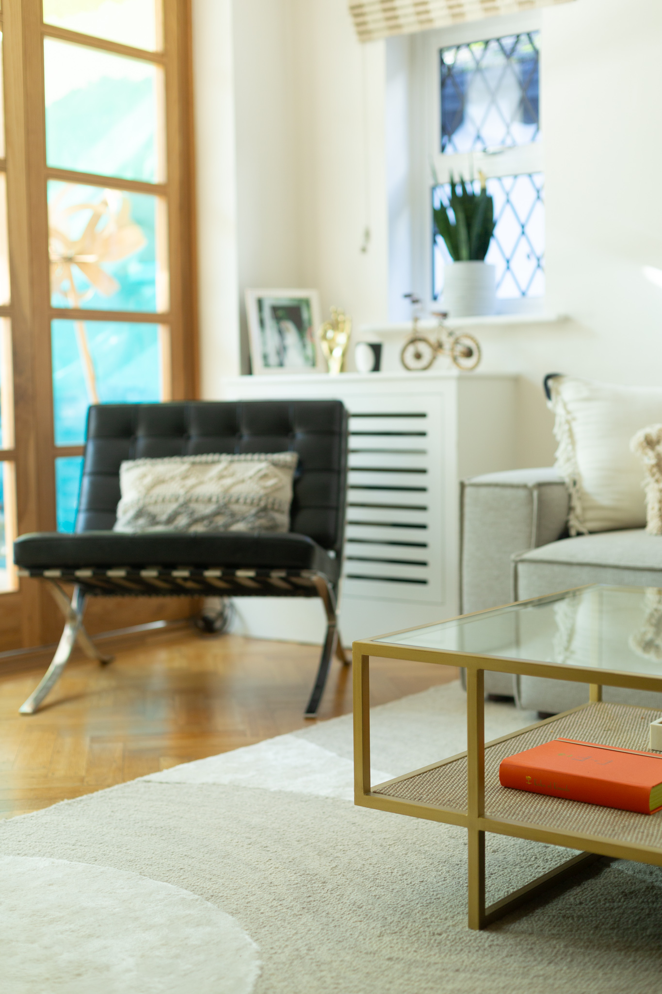
I spent ages looking for the perfect over-sized coffee table when I spotted this beauty online. The Aged Golden Coffee Table is ideal for this room. It’s a pretty spacious room and I really needed to keep the proportions in mind when buying furniture. The two-tier design is practical and minimalist, adding tons of texture (thanks to the rattan effect).
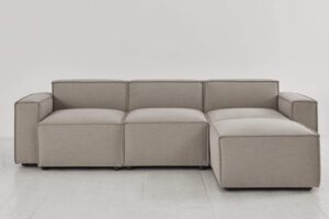
M O D U L A R S O F A S
I ordered our 3-seater and 2-seater sofas from Swyft Home. These are modular sofas, so you can build your own style by just adding extra units. My fabric of choice was pumice linen, which isn’t quite as stain resistant as they say. It’s pretty good, but not 100%. The sofas were delivered in a box within 3 days from making the order. I might write another blogpost about the sofas soon, but they are definitely more comfy than they look. I love them!
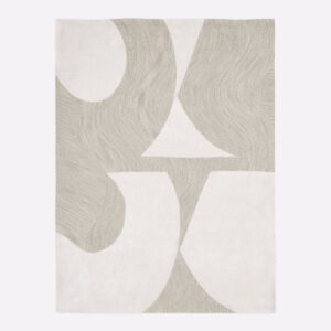
A S B T R A C T R U G
I spent ages looking for the perfect rug online and had almost given up when I found the Bold Cutout Rug by West Elm. I felt like it was specifically designed this room in mind. The bigger size (244-305 cm) is just perfect with the coffee table and the sofas. I made sure that the front legs of the sofa were on the rug. An oversized rug will make your room appear much bigger than a smaller one. This rug really pulls the look together, don’t you think?
B L I N D S & S O F T F U R N I S H I N G
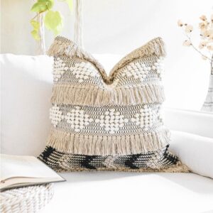
I wanted to keep the soft furnishing muted and neutral. The River & Ivy boho cushions add just the right amount of texture and character. We were very lucky to inherit these beautiful decorative silk blinds (similar ones here).
L I G H T F I X T U R E S
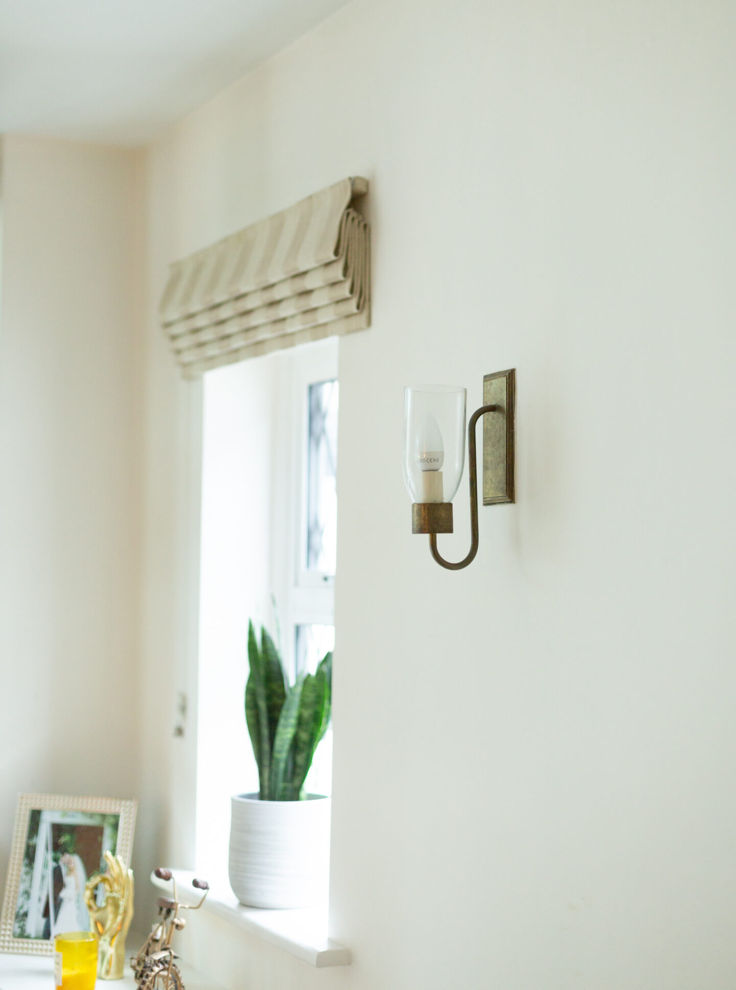
We also inherited the most gorgeous light fixtures from the previous owners. I love them so much that I didn’t want to change them. I like to mix metallics, especially brass and silver. It adds so much more depth and interest. I’ve kept it to maximum 3 different metals though to make sure that it’s not a total mismatch, but there are no rules really. Buy what makes you happy.
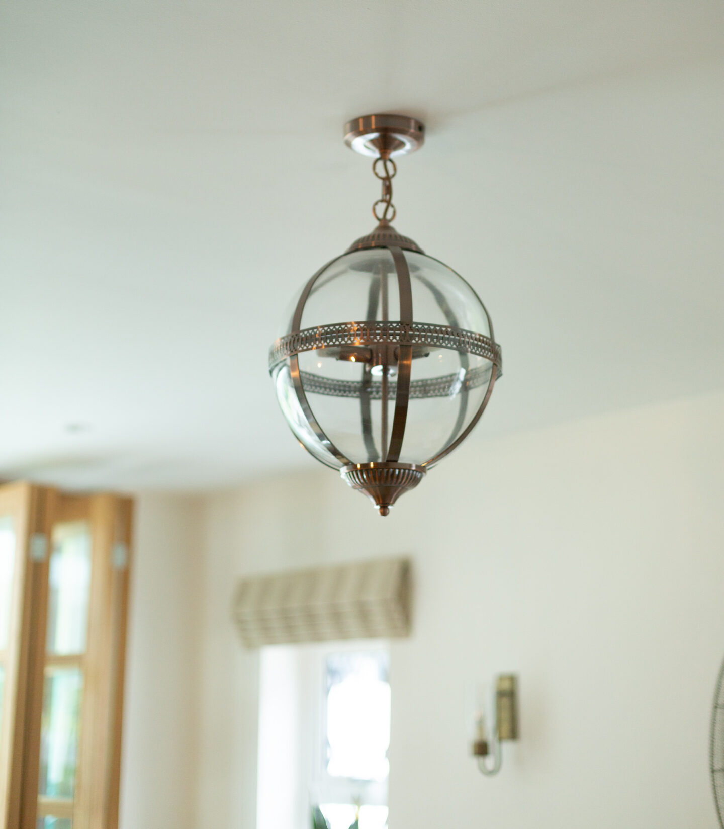
I had so much fun furnishing and decorating our living room without having to do any of the hard work (painting, renovating etc). We were very lucky and I have no doubt that our next year’s makeover will be a lot more work. We have another living room to fully refurbish and renovate and it will need a new floor, paint, new fireplace and all the finishing touches. I can’t wait to start planning it all now that we’re finished with this one.
I hope you’ve enjoyed our home tour and if you have any questions or comments just drop them on the comments section below!



Dearest Pia, your newly decorated living room looks fabulous – serene and calm. I think you’ve done a great job in adding your own stamp in this space, giving it a more personal identity that reflects you and your family. If I may, there’s one thing that I’m not sure of, the pendant light. I’m not sure if it’s the photo angle that throws me off, but it feels like a bit too small for this room; not the right scale. But, I could be wrong and misled from the photo.
In any case, I hope you make some of your very best memories in this beautiful living room of yours. It becomes you, xx
Author
Thank you, Velvet! I always love hearing your ideas and tips 🙂 We inherited the pendant so it might not stay, but I think the camera lens makes it look smaller than it is. I might go for a more statement midcentury-style pendant for this room one day. For now, this is perfect Xx