* This post includes gifted items.
Can you believe we finally have a piano in our living room? We’ve had the piano for years but it used to be hidden in my husbands mancave. I absolutely love how this little make-over turned out in the end. It has added sophistication and elegance to our TV room just like I had hoped. Pianos can be a little tricky to decorate around though, especially if you’ve never had one before. They are both decorative and functional and probably one of the most powerful ways to revamp any space. Also, if you think there’s no point just redecorating one corner in your room think again! I used to think that in order to give ‘a new look’ to a room I had to pretty much replace everything (or at least 80%) in it. Wrong. You really don’t. Depending on what you are trying to achieve you can make some big changes with just reshuffling a few accessories around, as long as they are quite important pieces of furniture for the setting. Bigger and brighter objects will catch your attention more than smaller items that just tend to blend in. So if you want to make some big changes with only few new items, make sure to go for eye-catching pieces that make a statement.
I wanted to give our living room a mini make-over after we moved the piano here. You can check one of my older posts here to see what this corner looked like before. My husband plays the piano and it used to be kept in his mancave. Last month he got a new exercise bike and there was simply no room left for the piano. I was (not so secretly) thrilled we finally had an excuse to move the piano to our TV room. I’ve been telling my husband how much we would benefit from having it in there and that the kids would play it more as well. Our 7 yo daughter is quite a keen pianist these days, so it was definitely a good move. Plus pianos are just so beautiful, aren’t they? I love a black, glossy piano. They are so elegant and sophisticated. I had fun picking a theme to go around it too. Luckily Pinterest is full of piano styling ideas which was obviously my first stop for inspiration. I loved the idea of floating shelves, gallery walls and statement art above the piano. In the end I felt this room needed some colourful art, so I started looking for a new art piece for the corner. If you own a piano (whether it’s inherited or bought) you should know that it’s going to steal the show. It will be a statement piece, whether you like it or not, and you shouldn’t even try to hide it or just try to blend it in as part of the decor. Incorporating a piano into a room should be a fun process. It can be a little tricky though as they usually quite big and also visually powerful.
Most people don’t have room for a huge grand piano (maybe one day!) but a smaller upright piano like we have is actually a lot of fun to decorate around. It’s crazy to think that we used to hide this piano in my husband’s mancave, right? It has given our living room the facelift it needed, although it’s probably also thanks to the new accessories we’ve dotted around it. I love monochrome interiors but I also realised that this room needed a bit of colour to soften the overall look. I also wanted to add few different textures to give a nice contrast to the glossy surface of the piano, which is why I opted for a sheepskin throw/rug on the stool and decided to mix different materials (like glass, metal, seagrass baskets etc) together. Since everything else is quite minimal in this space, I could get away with getting a bit more creative with colour and art. I’m not a fan of ‘busy’ interiors (usually). I prefer Scandi minimalism as it allows me to think more clearly and feel more at home. We are all very different though and what works for me might not be ideal for you (that’s why I believe we should all find our own individual decorating style that makes us happy).
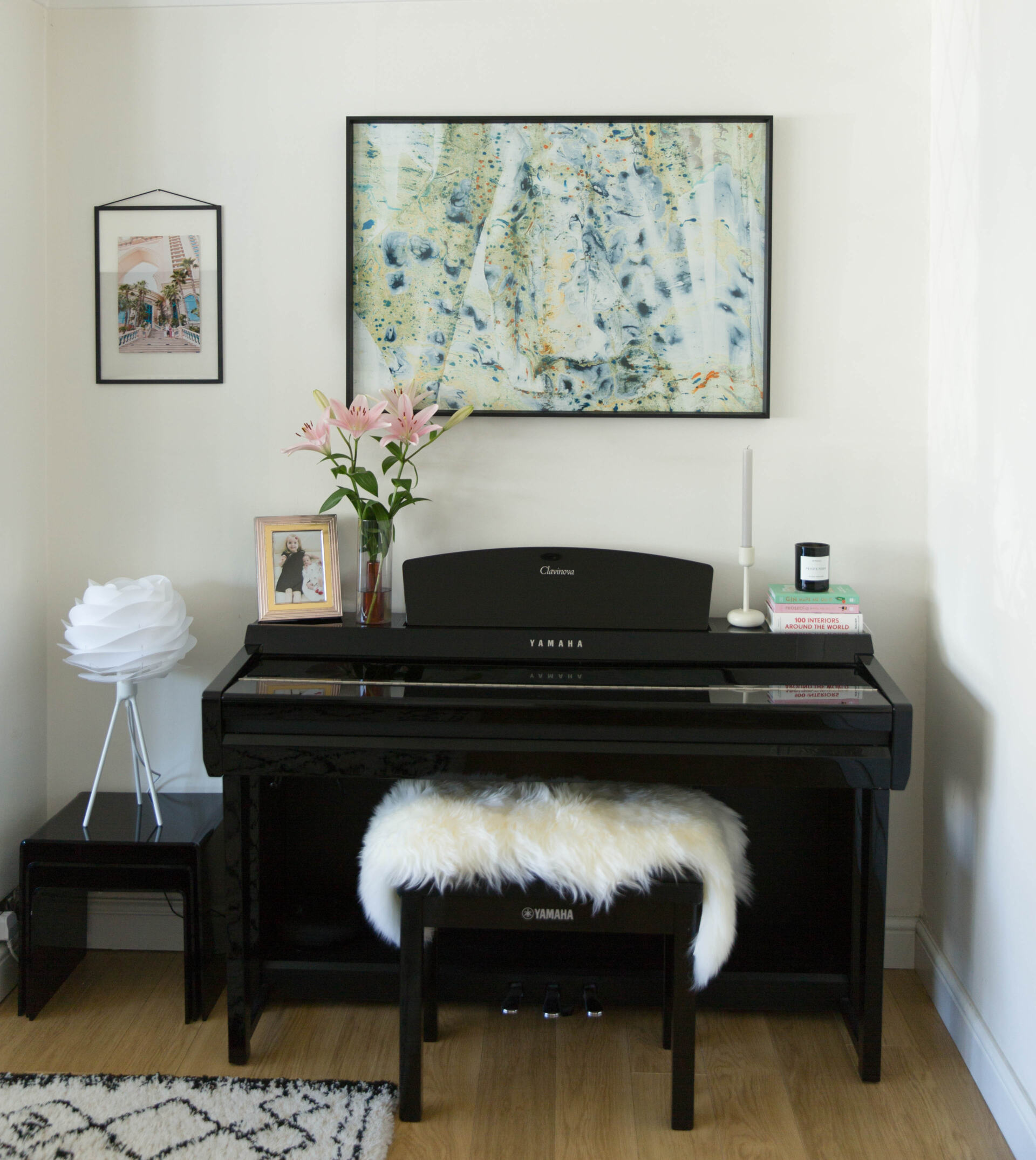
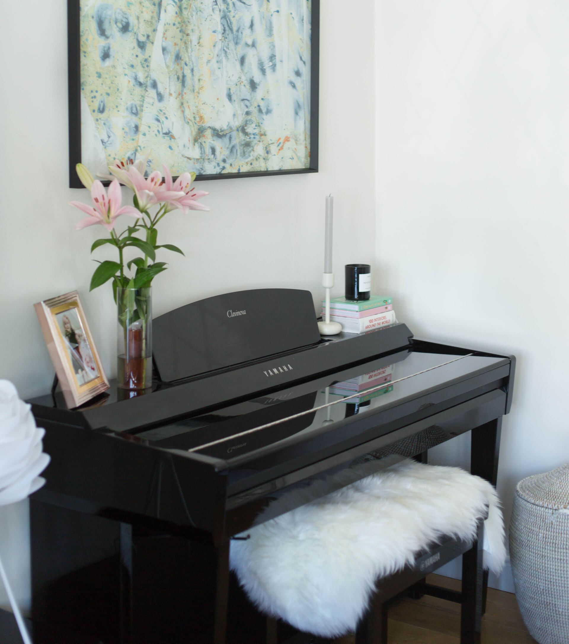
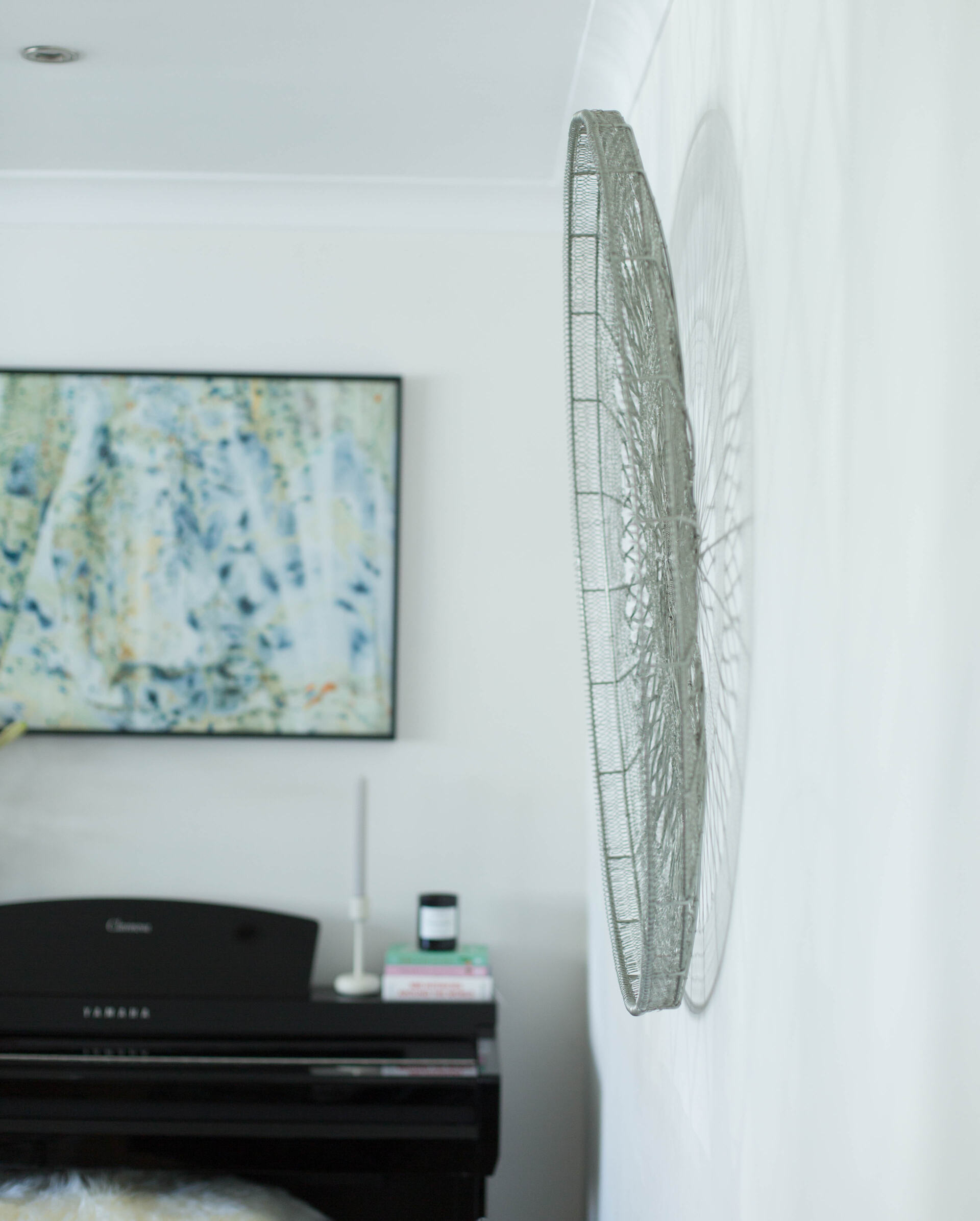
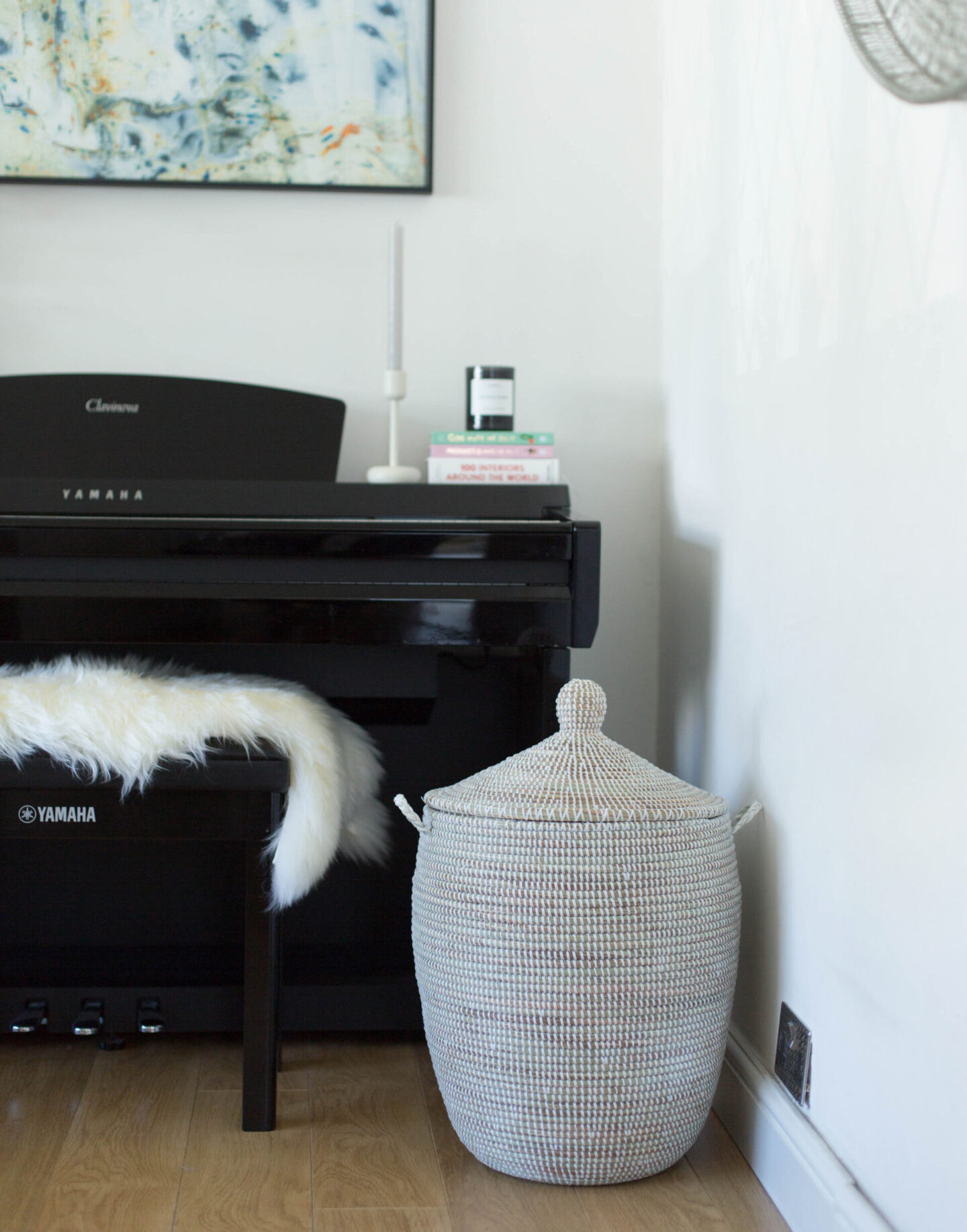
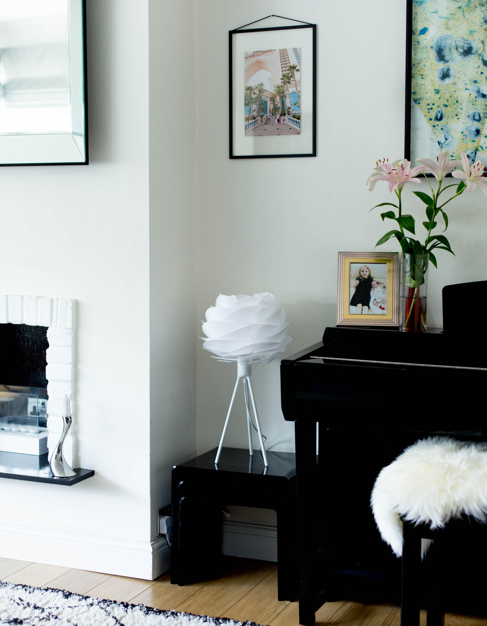
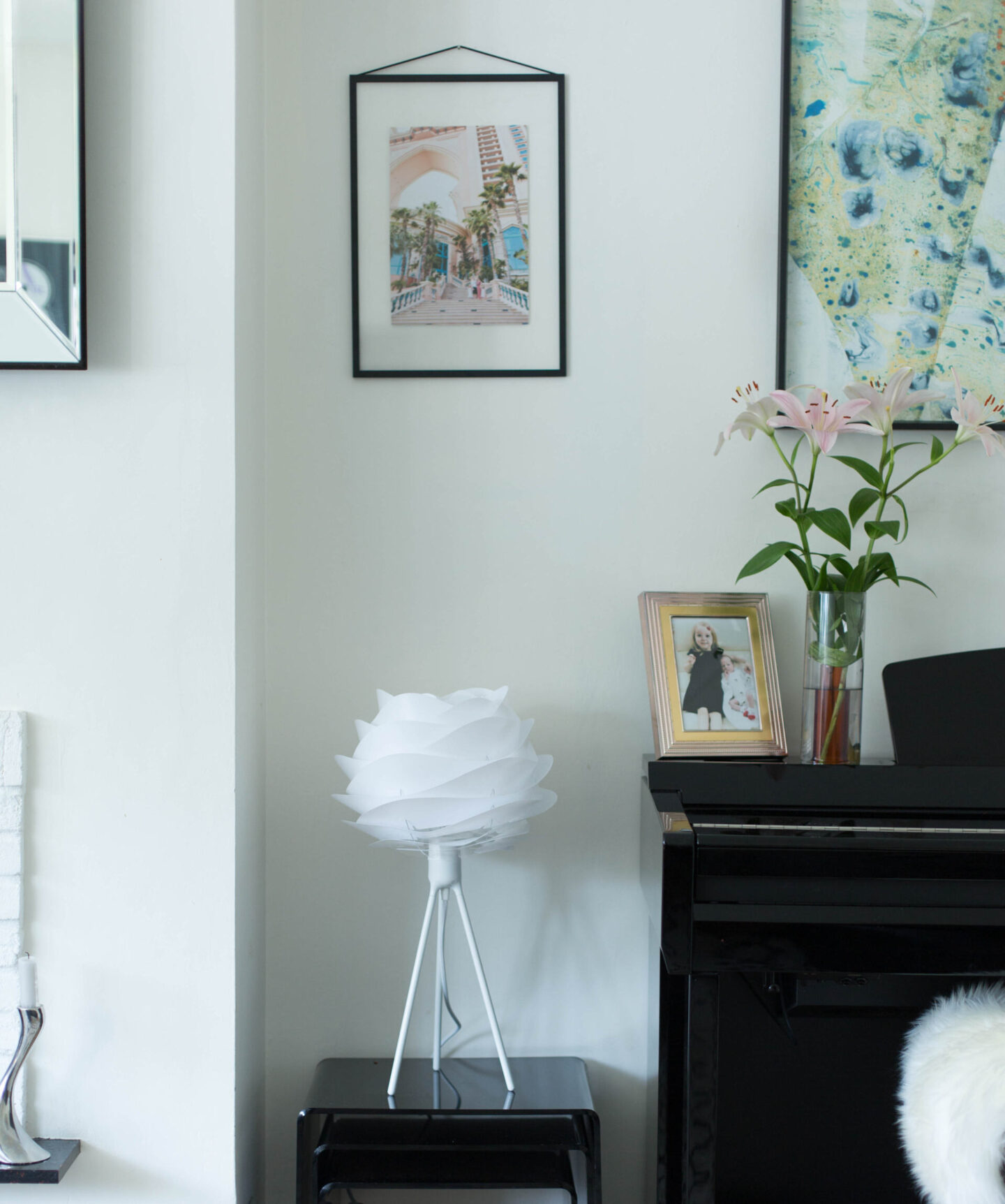
Like I said, I wanted to use a bit more colour in this room than I normally would. I used a lot of complementing colours when decorating this corner. The marbled art by Nat Maks (*gifted) really sets the tone for the decor and that’s why I decided to base all the other decorating decisions around this wall art. It wasn’t so much about matching objects, but more about finding complementing styles to go with the art. Nat’s art is created by using an ancient Japanese method called ‘Suminagashi,’ which inspired me to create a blend of Japanese and Scandi interior style. In fact, the ‘Japandi’ interior trend is huge right now (and has been for a while). Japandi emerges Japanese and Scandi styles together to create serene and uncluttered interior schemes. It’s all about balance, accents and simplicity. Natural materials play a big part in it too. Anyway, I’m a huge fan of this new Japanese/Scandi trend, although I don’t really like to follow trends too much. It just happens to work very well at the moment with the aesthetics I’m going for. The Carmina lamp shade, by a Danish lighting and furniture brand called Umage, looks so subtle and chic in this space. I paired it with the white Tripod stand that goes so well with the minimal look I’m going for. I’m a huge fan of Umage lighting products. I also have two other table lamps from them which I adore. Most Umage products are interchangeable which means I can use my Carmina lamp shade with their floor lamps, ceiling lights etc. I just love how versatile the products are.
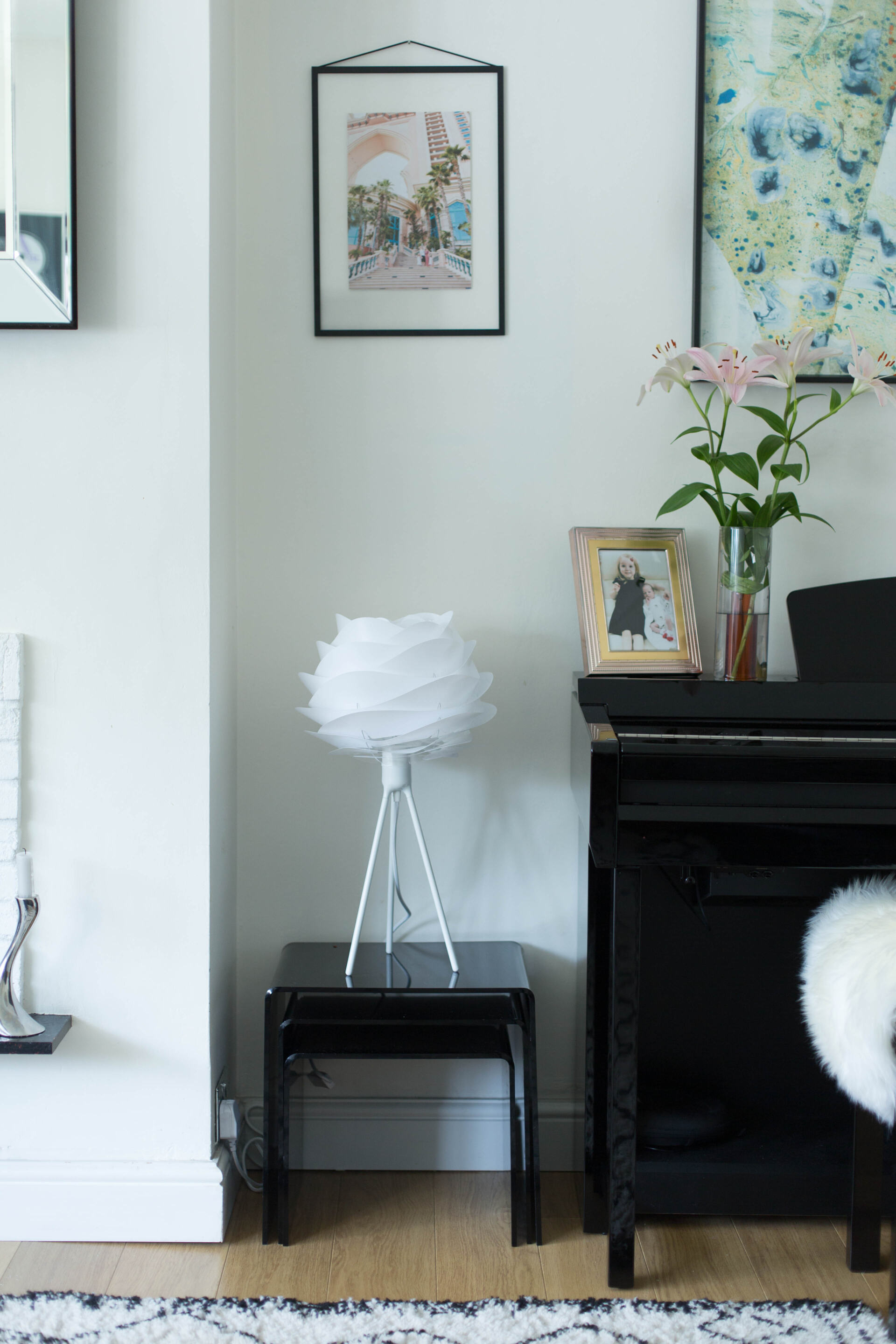

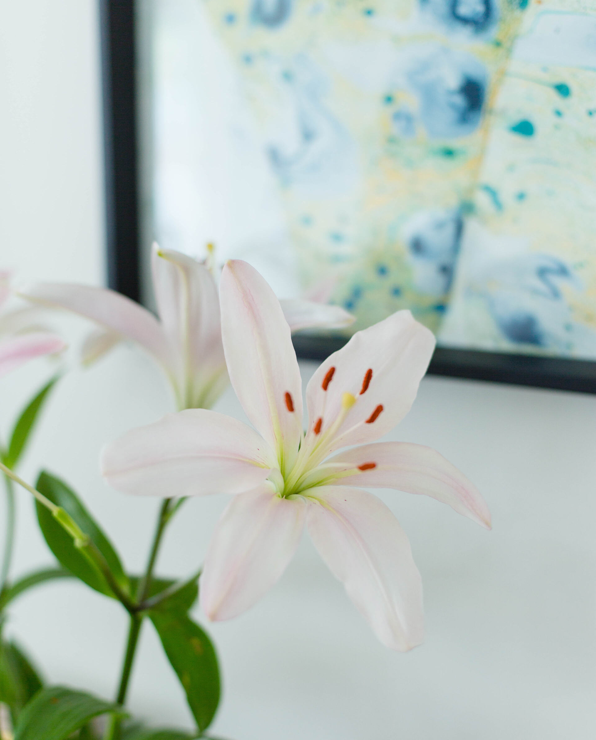
The hanging black frame is by another Danish brand called Moebe. I thought it would make a nice change to display one of our last year’s holiday photos in the frame to give our TV room a more personal feel. I don’t have tons of family pictures on display at the moment. I wanted this room to feel serene and clutter-free so it might just stay that way. I find this photo quite architectural actually. We had it taken last year in Dubai at the world-famous Atlantis the Palm. You can read more about our trip to Dubai here. It was such an amazing holiday and I do miss travelling, so it was lovely to find a spot for this picture in our living room. The black hanging frame looks so cool, doesn’t it? I love that this picture has a lot more color than my usual art prints. The reversible glass vase (in grey) by Block Design (*gifted) looks stunning paired with some lilies. It looks equally pretty though with some dried grass or individual flower stems.
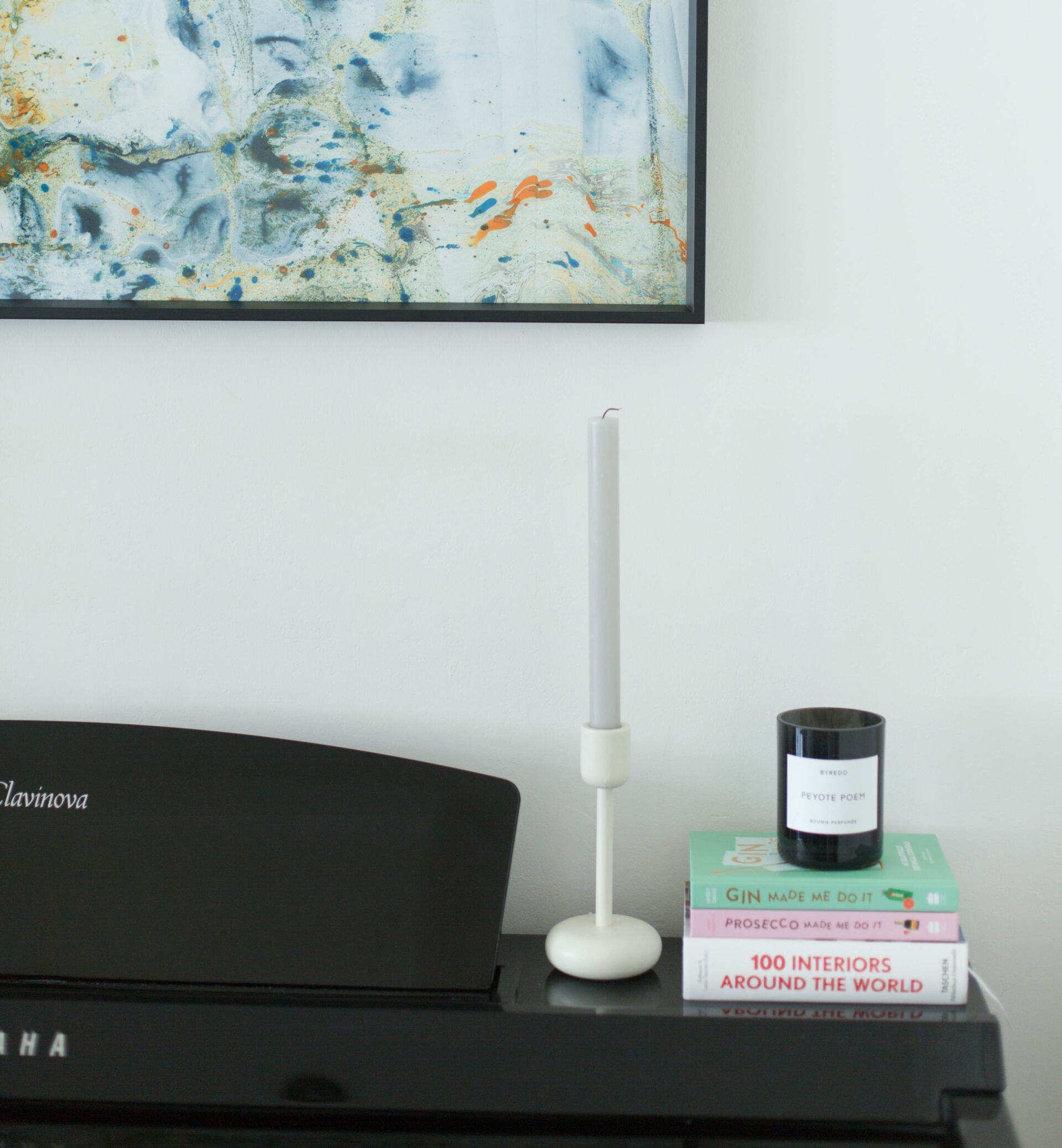
If you’ve been reading my blog for a while now, you’ll know just how much I love coffee table books. I wanted to create a pretty ‘vignette’ here that would be relaxing to look at while you’re playing the piano. Vignette (in interior design) is a visual composition made up of decorative items. There are so many different ways to create a vignette but I think the most important thing is to use items you love. Personally I like to stick to a theme and colour co-ordinate whenever possible. I also like to make sure that I use different type of decorative items and vary the heights of the objects. I also love using candles and candle holders next to coffee table books. I’ve had my Iittala Nappula candle holder for over 7 years now and I also have the Nappula candelabra. They are both such classics. I think creating vignettes is probably one of my favourite things to do!
I think I’ve covered pretty much everything. I do think this mini make-over was definitely worth it. Our living room hasn’t been my favourite room for quite some time. I’ve been meaning to get a new sofa now that our girls are a bit bigger, but we are planning to move house in a few years time and that has put me off buying one now. I’d rather get a new sofa for the new house when I know what size/shape room we will have. Funnily enough, our new piano corner has gotten me excited about this room again. I love it now! I enjoy spending time there and listening to my husband and children play the piano. It’s amazing how moving the piano here has made such a huge difference. I didn’t spend much money on this make-over either as most items were reshuffled from other rooms. It really has made a big difference at very little cost.
Feel free to leave a comment below and share your piano styling ideas with us!


