Travelling is a great way to gain exposure to foreign cultures and varies interior design styles. I’ve been very curious about different cultures and languages for as long as I can remember. I’ve lived in 4 different countries, so I guess it says something right? I always try to do as much research as possible too. Of course the location is important but I also pick hotels based on their interior style every now and then. Trip advisor reviews and images are so important. I’ll know straight away by looking at the photos whether I’ll enjoy my stay there or not.
I had the pleasure to stay at the stunning Gran Melia Palacio de los Duques in Madrid last month for 3 nights. My husband was there for work, so I decided to join him. I wanted to stay in the centre of Madrid close to all the sights and shopping streets. I looked at few different hotels but it was pretty obvious from the start that the Gran Melia Palacio de Duques was going to be a winner. This was my first time at a Gran Melia hotel (I’ve heard so many good things about them) and it did not disappoint. The customer service was out of this world and obviously the elegant interiors really stood out for me.
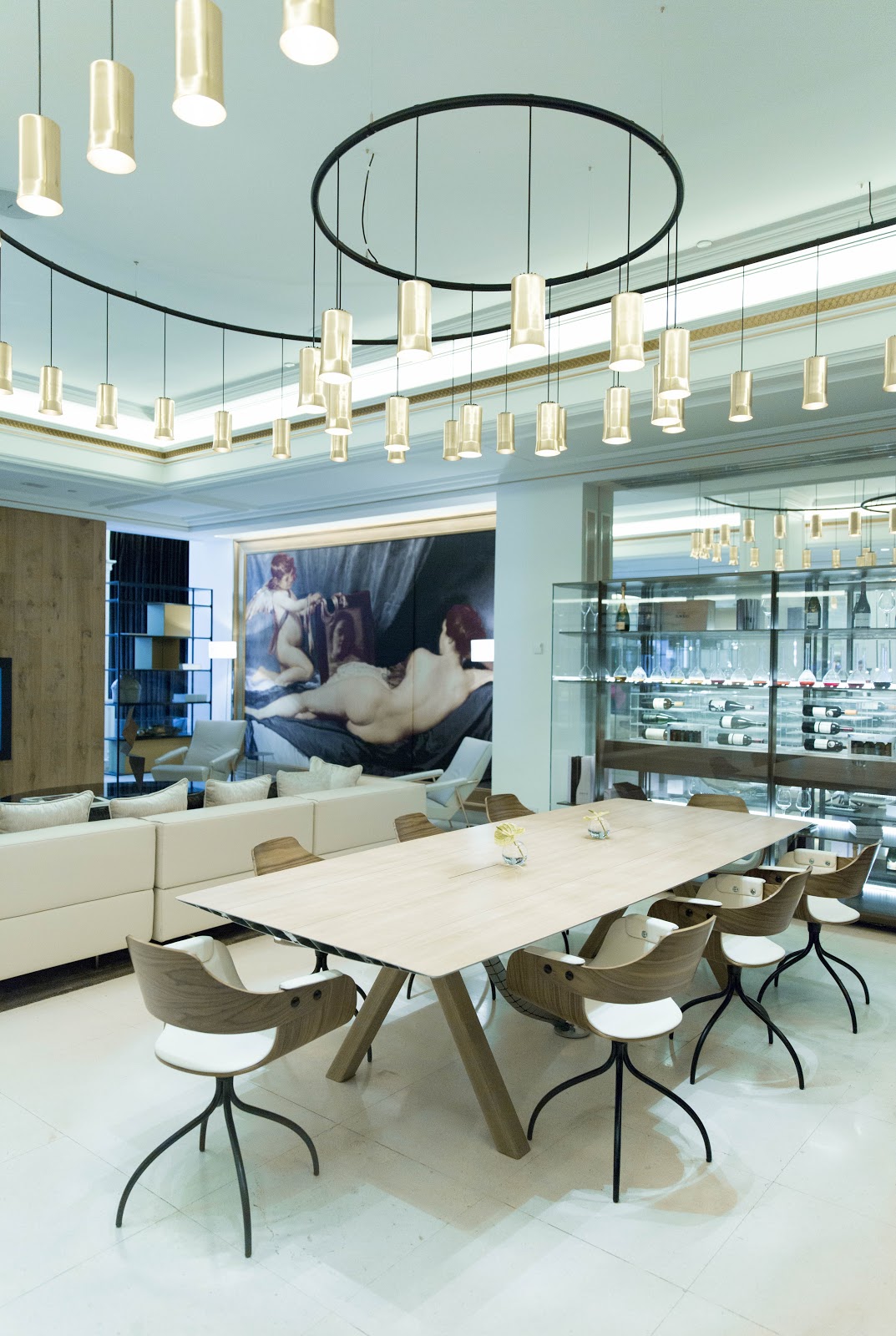
So, let’s focus on the interiors since they pretty much blew me away from day one. I’ve never been to a hotel that was so ‘me’ if that makes sense. Ok, maybe the antique paintings are not exactly my usual style but whoever designed this hotel made it all work so effortlessly together. Mixing old and new can be challenging. It helps to keep all the artwork similar, like in this case. The hotel itself is an old 1800s palace, so it made sense to embrace all the original features like staircases, high ceilings etc. Almost all the walls were painted white (very little wall paper was used) allowing the antique paintings (inspired by the work of a famous Spanish painter Diego Velasques) to really stand out. I’ve always loved the contrast of black and white and they certainly knew how to make most it in this space. The hotel felt very cosy and inviting. More like a home if that makes sense. There were cushions and area rugs everywhere to add warmth and texture to the space.


I also love the use of wood everywhere. The wooden dining tables looked stunning and practical. I cannot wait to get my own custom wood table soon. I would pair the table with similar chairs (with black legs), although I haven’t quite decided on the material yet. The black and gold contemporary lighting pendants complemented the rest the decor and worked particularly well because of the high ceilings.


A large industrial shelving unit like this works well as a room divider in bigger open-plan rooms. I love the way it was stacked with coffee table books, photo frames and few carefully selected ornaments. You could just pick up a book and sit down for a coffee as if you were staying at your friends house. It definitely felt more like staying in a palace rather than a hotel.

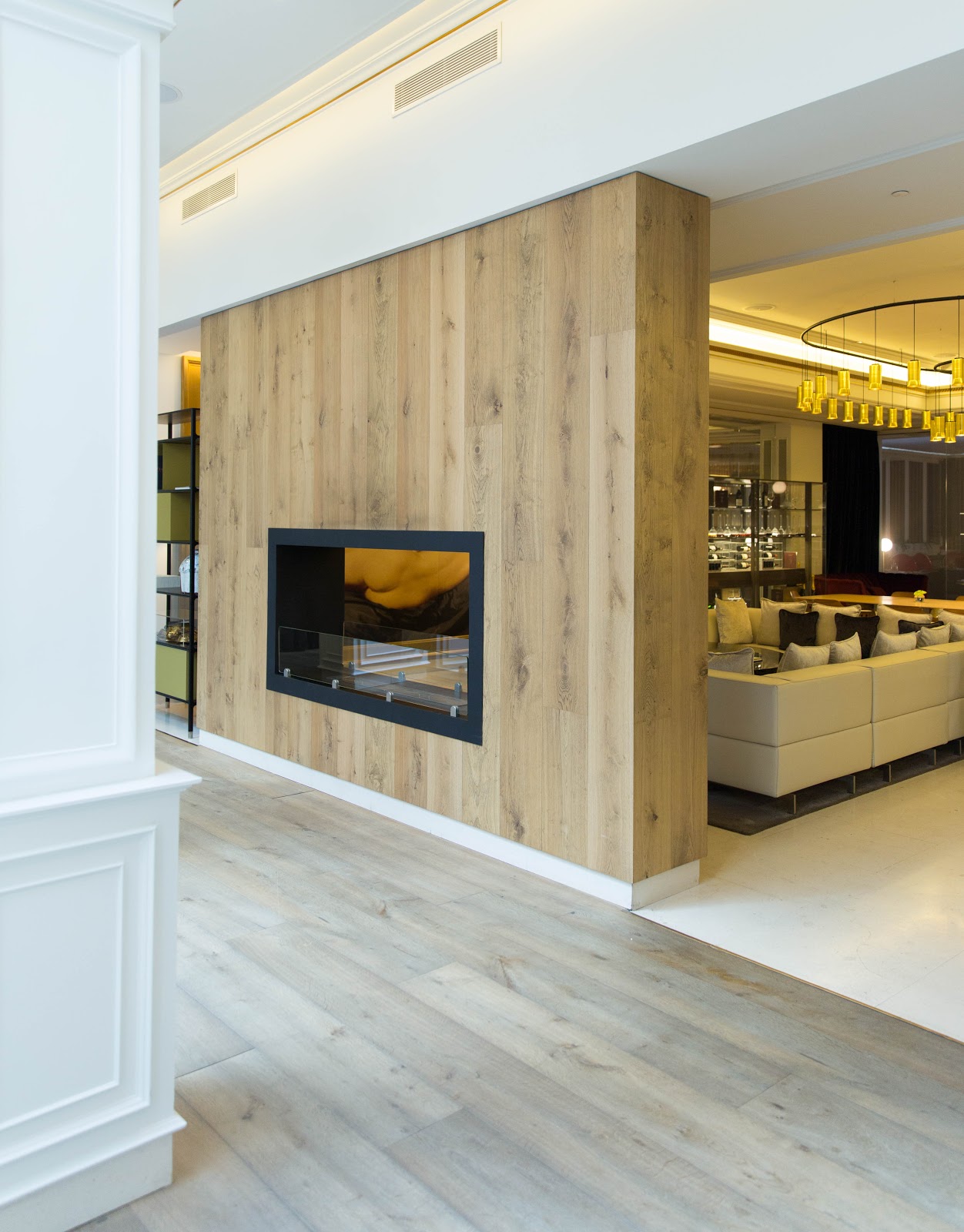
Here’s another great example how wood can add texture and softness to any space. I love the idea of a wooden feature wall and a built-in contemporary fireplace. I also love that they didn’t try to match all the woods. Why would you? It’s far more important that all woods complement each other.

This chandelier certainly doesn’t look out of place here. The big roof window allow tons of natural light to enter the room, making it appear even bigger. In this case you can only go for a big statement chandelier. I do love all the architectural splendour. The entire hotel feels traditional and contemporary at the same time. They have really got the best of both worlds in my opinion.

Now of course the outside terrace was as pretty as the interiors. You can have your breakfast or lunch here. Mind you it was pretty hot some of the days. I think +33 degrees Celsius is a bit too much for lunch outside, but of course it means that you can go for a dip in their roof top pool afterwards which was super refreshing. We also had dinner in the Dos Cielos restaurant which I totally recommend (even if you’re not staying in the hotel).

I didn’t take many pictures of our (deluxe) room mainly because I found it pretty basic. It wasn’t huge and the view was nothing special. It was a typical city centre hotel room, albeit a stylish one. It was perfectly fine for us during our stay and we didn’t really spend that much time in there anyway. We also opted for their red level service (separate check in, deluxe room and access to the red level lounge etc) and now that was worth every penny. We ended up having lunch (tapas) there everyday and it was well worth it. They even had complimentary Ruinart champagne in the lounge, plus soft drinks, spirits, macarons etc. Literally anything you’d want when you’re on a self-indulgent luxury holiday. If you’re planning to eat lunch out every single day it may not be worth it, but for us it definitely was. Would I stay here with our two children? Maybe, but only when they are a bit older. It’s such a relaxing and tranquil hotel that I feel it would be a bit of a waste with small children. If you’re travelling as a couple or with work I totally recommend this place. I personally cannot wait to go back and discover more of Madrid next time.
Does the hotel interior matter to you? If you have any recommendations, leave a note below or comment on Instagram!
SHOP THE LOOK!
Chandelier by Flos
Wooden table by Catalan Italia
Khalida bookcase by Made
Habitat Sophie Oak dining chair
Area rug by Wayfair
Diego Velasquez art prints
Velvet cushion by Laura Ashley